The Antidote to a "Beige" World + A Guide to Mixing Patterns Like a Pro
We’ve all seen it, and maybe even lived it at one point or another in our lives—the endless scroll of "sad beige" interiors and sterile grey palettes. They often come to our homes by way of new construction as "builder beige," or because the seller believes it's easier to sell a neutral colored home when it's put on the market, or maybe you've been told that neutral colors in a minimalistic palette is calming and cozy.
While all of these things are true, for many of us, they can feel a bit... well, soul-hushing. And, I would argue that, as someone who views art and color are as necessary as breathing, you can achieve the same goals-appealing to many new potential home buyers and creating a calming and cozy feeling - without excluding color from your home. I believe your home should be more than just a quiet space; it should be a vibrant sanctuary that refills your cup after a high-pressure day.
Now, this doesn’t mean your home needs to be pattern-drenched to be full of life; but the intentional use of color and pattern mixing to evoke a specific feeling the moment you walk through the door, can go a long way to breathing life into an otherwise neutral palette making your home the place you would relish spending time in.
In my latest collection, Pollinator Paradise, which I shared with you last month, I didn't just pick colors that looked "nice"—I chose a Toasted Lemon to mimic the bright energy of a Saturday morning and blues and teals to provide that "relaxing respite" we all crave before the chaos of the week comes calling. When you stop decorating for "trends" and start decorating for your own joy, you aren't just filling a room; you're curating an escape.

Now if you’re thinking, “but Nydia, you’re an artist and have experience pairing colors together in ways that can evoke certain feelings. I don’t know a warm color from a cool color and don’t want my home to look garish or gaudy.” I totally understand. My recommendation is to start small.
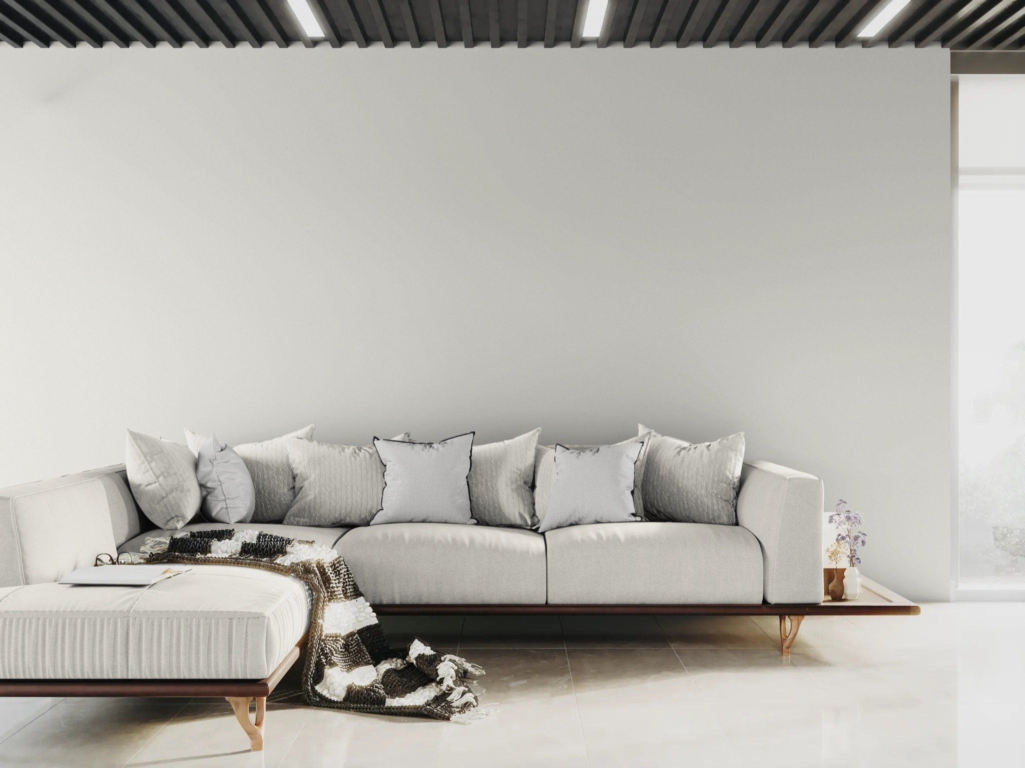
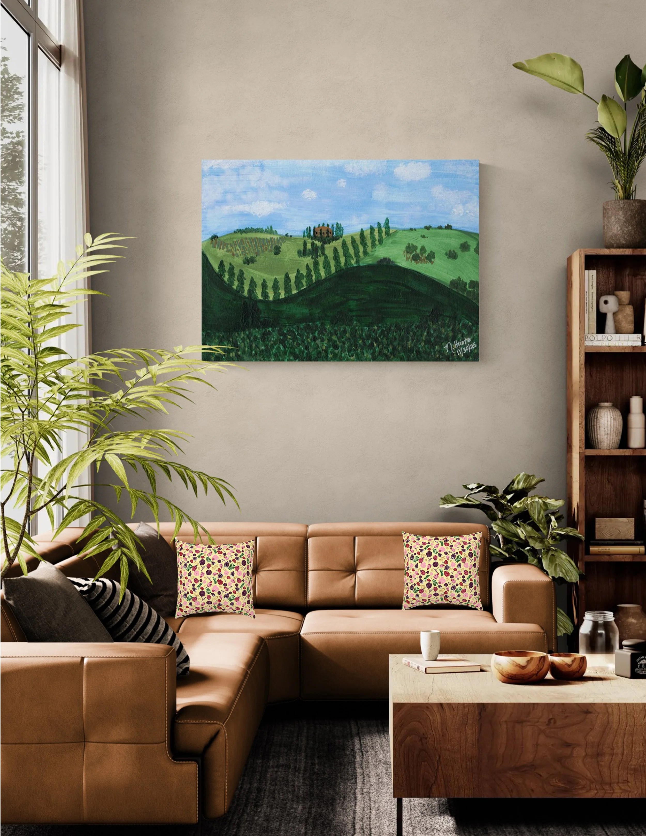
Experiment in a powder room or a reading nook, or simply try spicing up a solid-colored arm chair or couch with brightly colored or patterned throw pillows. See how the addition of the teal from my Hibiscus Breeze pattern on the pillows in the grey room above adds a little pop while keeping the room feeling calm. In the room below, my Garden Gala design on the pillows against the warm brown of the couch adds a ray of sunshine to the room while the ladybugs and dragonflies in the pattern add just a touch of whimsey.
Ready to move beyond the beige?
If you’ve ever felt overwhelmed with color and pattern mixing or worried that too much of either will look like a mess rather than a masterpiece, I’ve created something just for you.
[Download the Pink Sapphire Guide to Pattern Mixing Like a Pro]
In this free 4-page PDF, I’m sharing my design secrets for mixing patterns and adding color to your home and textile projects with confidence. Whether you’re a Mindful Maker planning your next sew or a Home Curator looking to refresh your table linens, this guide will help you use the "Rule of Three" among other helpful tips to build a palette that feels as soulful and layered as your favorite memory.