Inspiration Corner: Finding Timeless Charm in the Colors of 2026
The unveiling of the annual Colors of the Year is always a delightful peek into the future of design. For 2026, major paint manufacturers have spoken, and the message is clear: we are moving toward thoughtful, grounded colors that prioritize warmth, serenity, and longevity. As you look to infuse your everyday life with charm, let’s dive into the common theme and explore how these timeless hues can inspire your next décor project.
From Grounded Greens to Rich Espresso: How the 2026 Colors of the Year Will Elevate Your Home
The unveiling of the annual Colors of the Year is always a delightful peek into the future of design. For 2026, major paint manufacturers have spoken, and the message is clear: we are moving toward thoughtful, grounded colors that prioritize warmth, serenity, and longevity. As you look to infuse your everyday life with charm, let’s dive into the common theme and explore how these timeless hues can inspire your next décor project.
2026 Colors of the Year, by Paint Manufacturer:

The 2026 Color Trend: Enduring Warmth
If we look closely at this delightful palette, the clear trend is "enduring warmth." The colors are heavily focused on deep, earthy neutrals and restorative greens, moving away from bright, saturated tones.
This trend encourages creating a warm, cozy interior that is refined and promotes a sense of grounded calmness—perfect for the homeowner who desires enduring style.
Art Pairing: The Best Colors to Complement the Trend
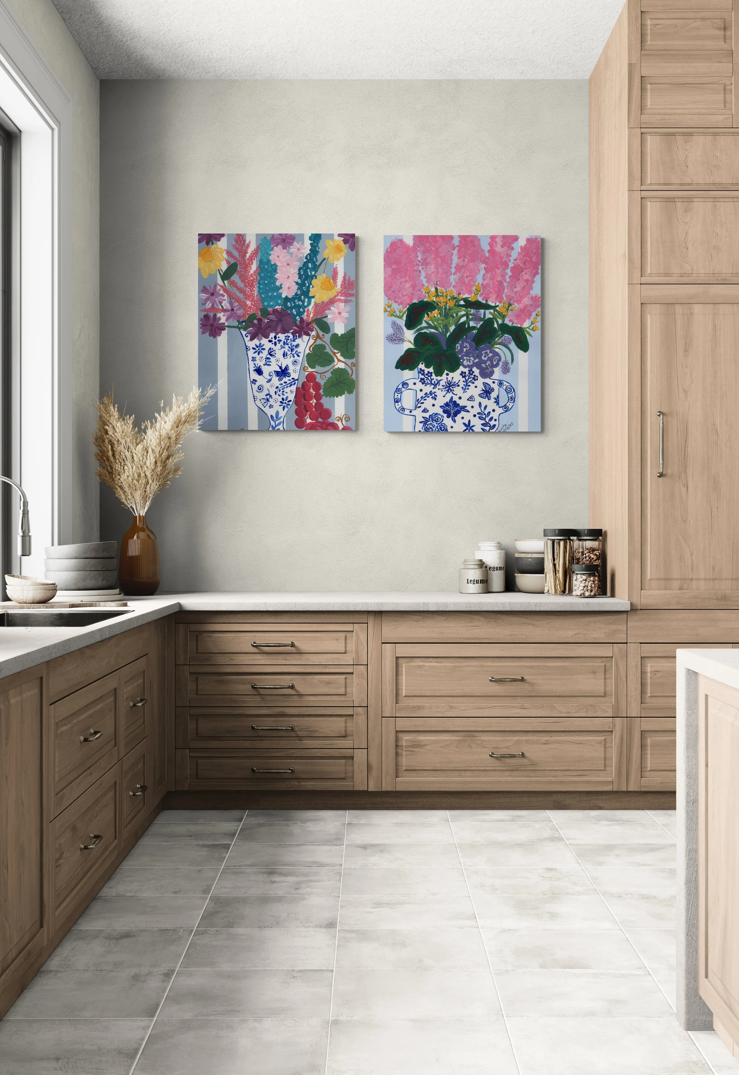
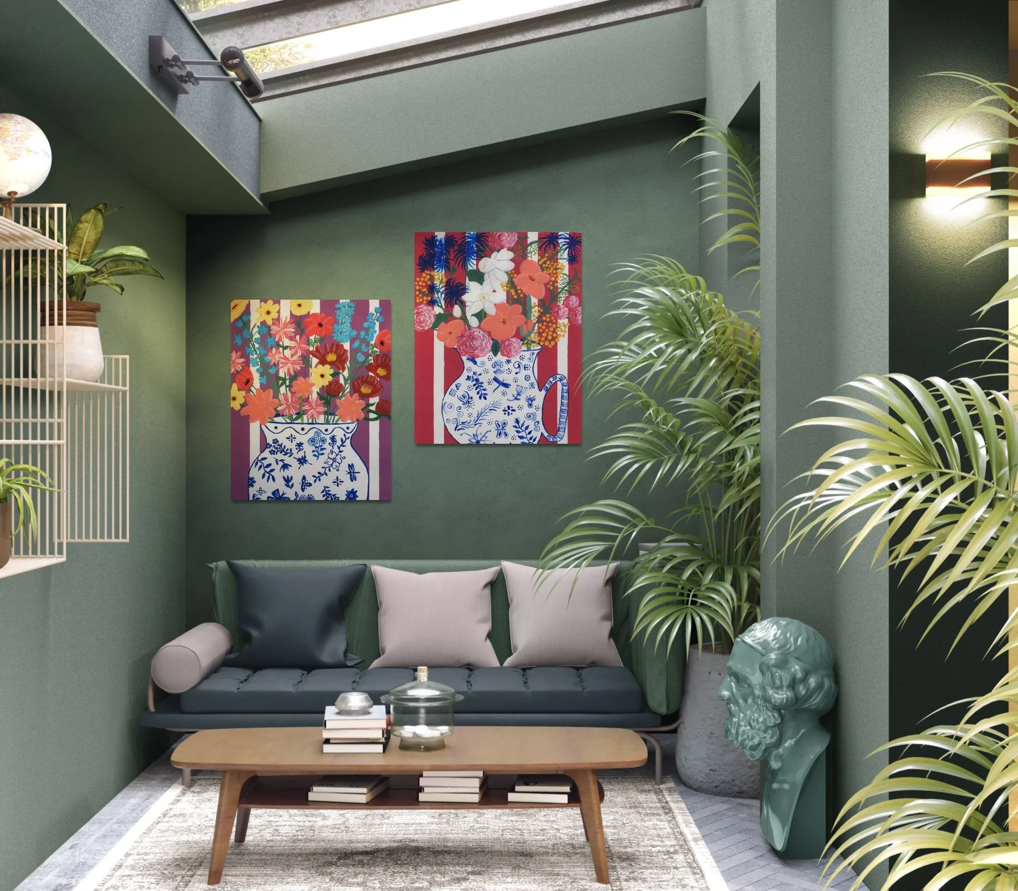
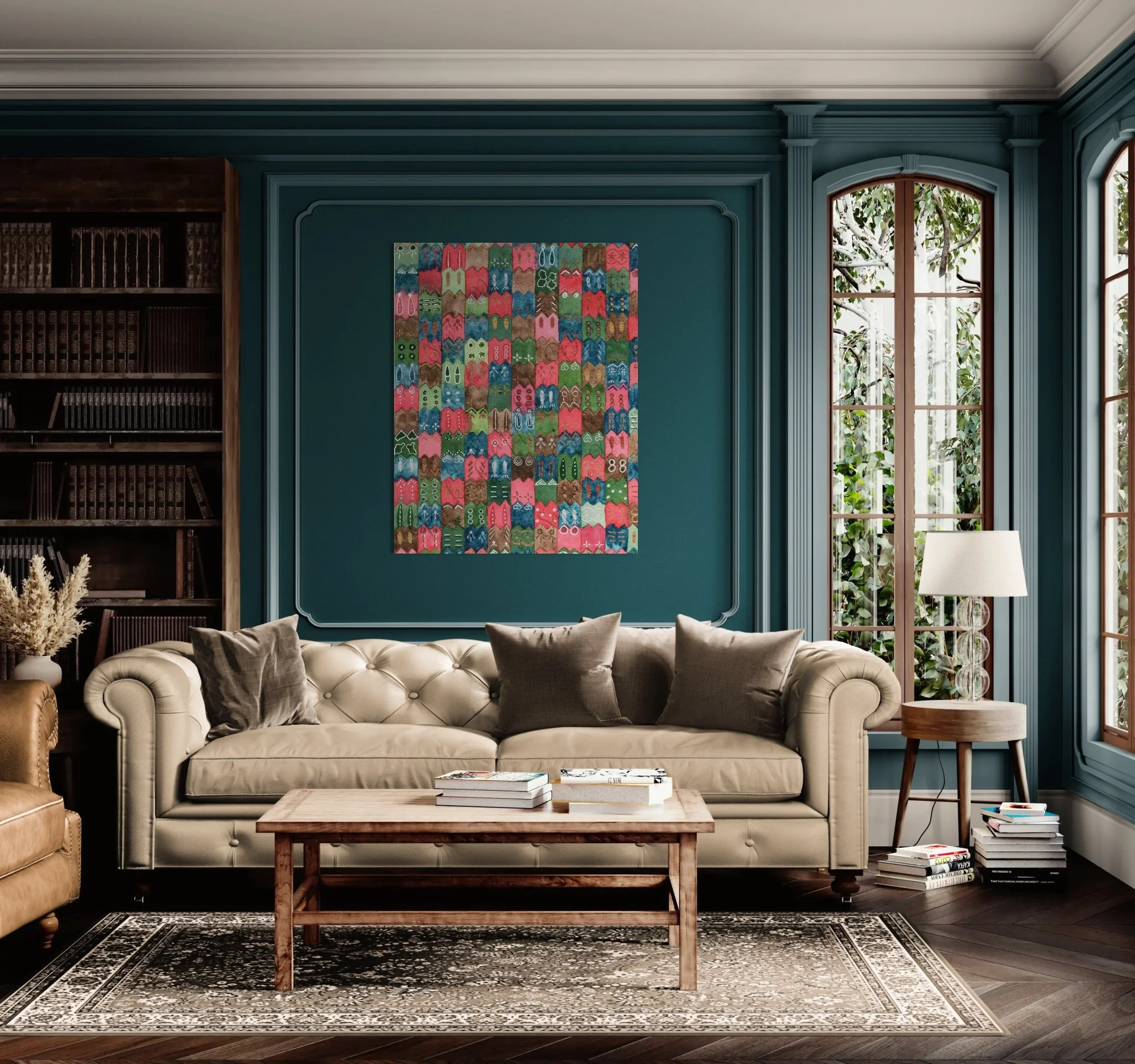
For walls painted in these sophisticated shades, the best art pairings should either offer high contrast or a complementary color family to bring life and coziness to the space.
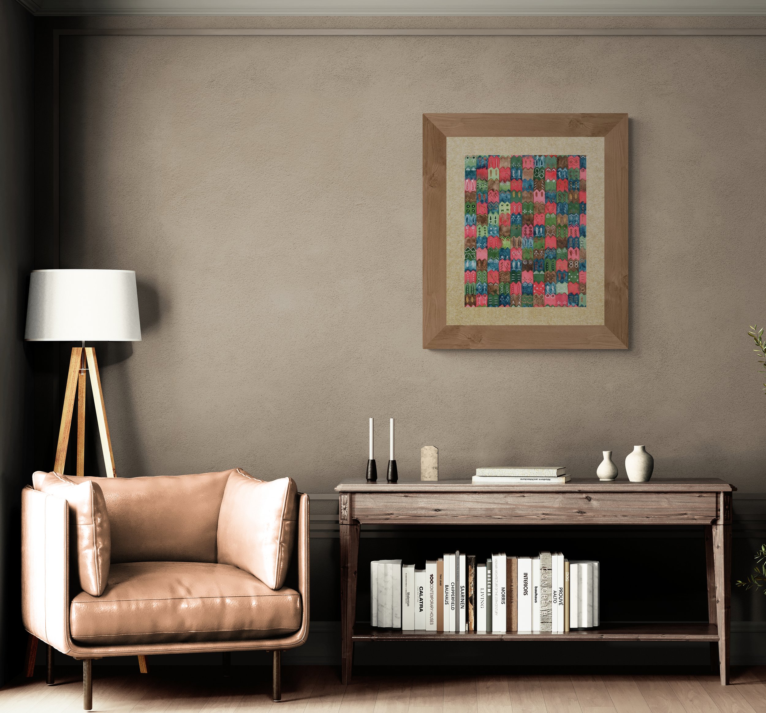
For Deep Walls (Silhouette [Espresso], Mahogany): Look for artwork with bright, vibrant yellows (like mustard or gold), crisp whites, or soft pinks. These colors will truly pop against the dark backdrop, adding a delightful energy and elegance. Alternatively, deep, rich greens, blues, and reds will provide a softer look.
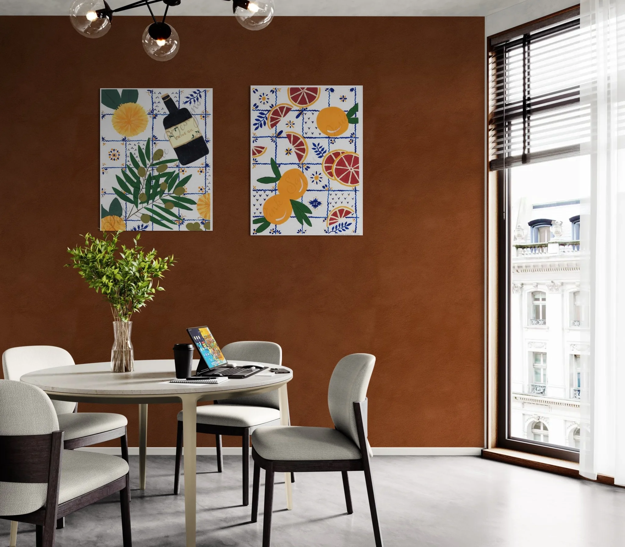
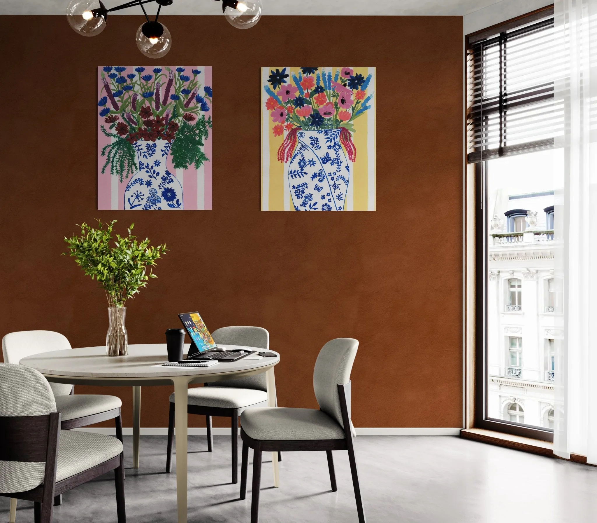
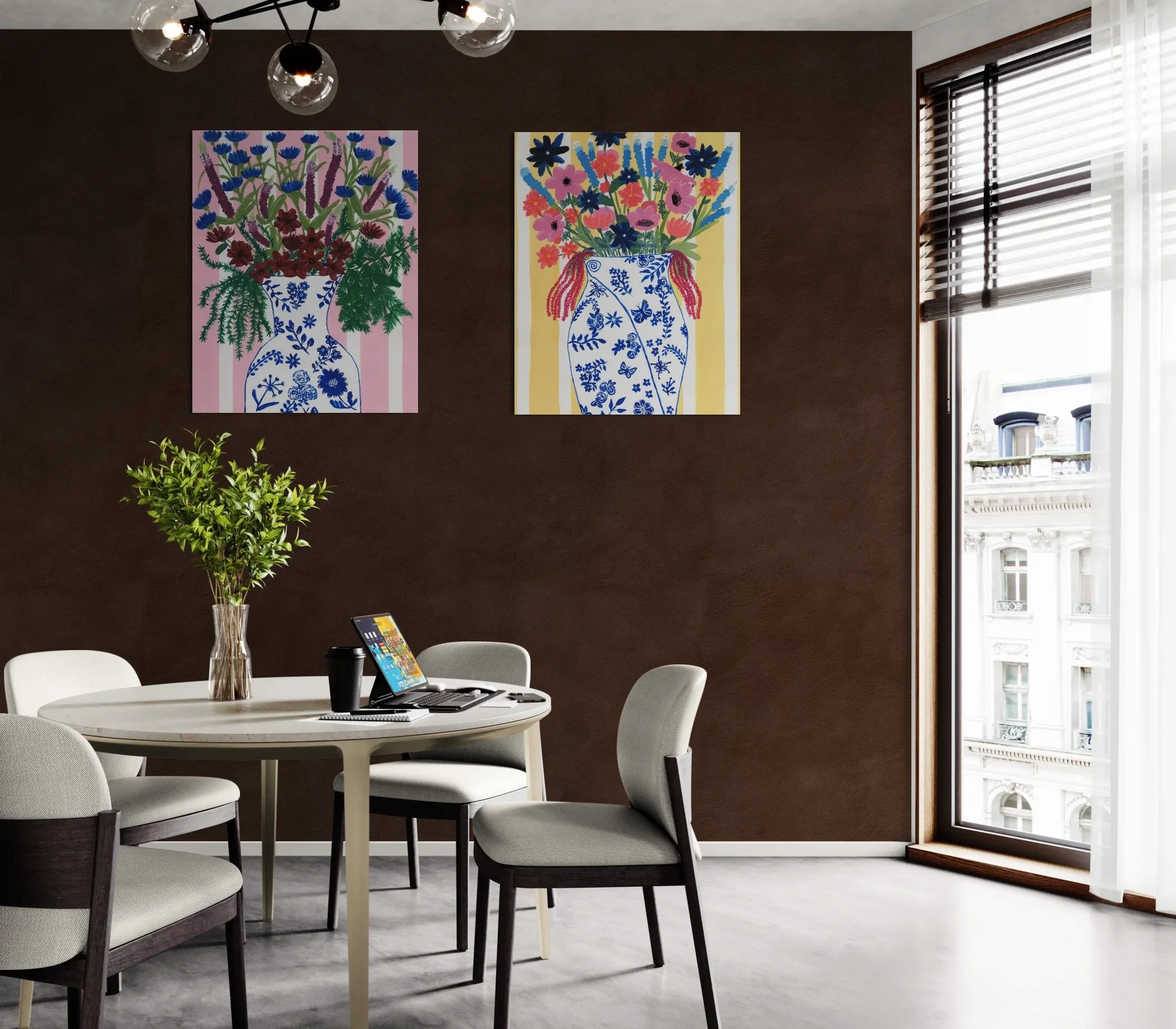
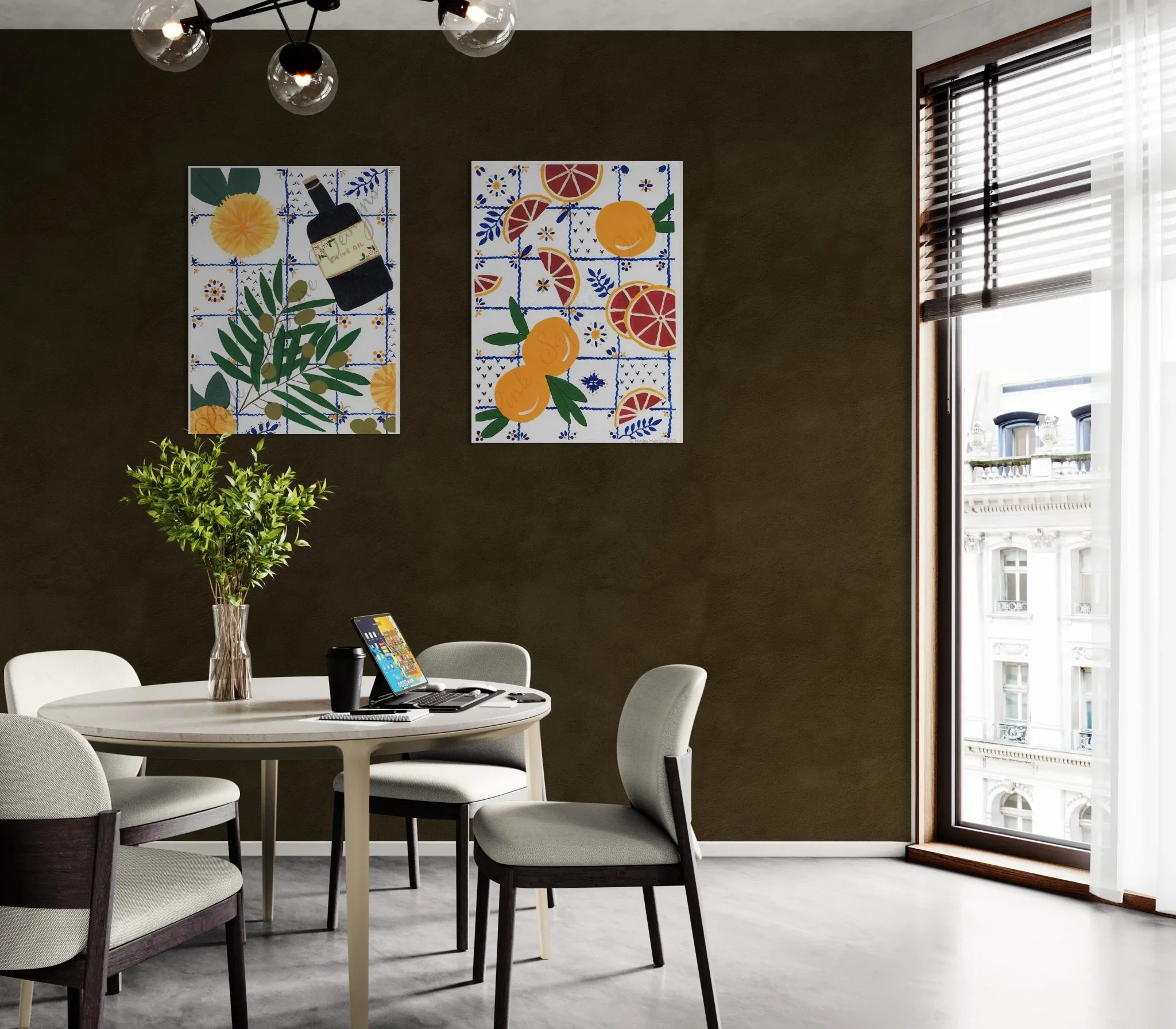


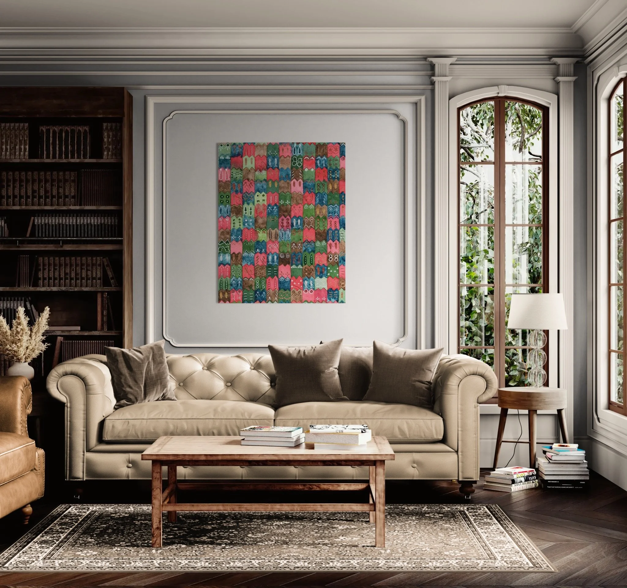
For Neutral Walls (Khaki, Ivory): These walls act as a beautiful, timeless canvas. Seek art that features deep, beautiful blues, rich terracotta reds, or jewel-toned teals. This is the perfect opportunity to showcase pieces with complex color stories.
For Green Walls (Jade, Safari, Eucalyptus): Since these greens are already very calming and natural, art featuring warm, deep reds (like burgundy or merlot), pops of bright coral, or elevated botanical illustrations with white backgrounds will create a sophisticated, layered look.
✨ Finding Your Charming Art Pairing
This trend toward deep, earthy neutrals and restorative greens is a beautiful opportunity to create a warm, cozy interior that feels both refined and deeply personal. Remember, your home should reflect your unique charming style. Whether you are seeking a vibrant piece to truly pop against a dark wall or a canvas with a complex color story to elevate a neutral space, the goal is to create a space that is uniquly you. I’ve always believed that art is the final touch of joy that ties a beautiful room together.
Now, I'd love to hear from you—which of these 2026 colors are you most excited to bring into your home? Please reply to this post and let me know!
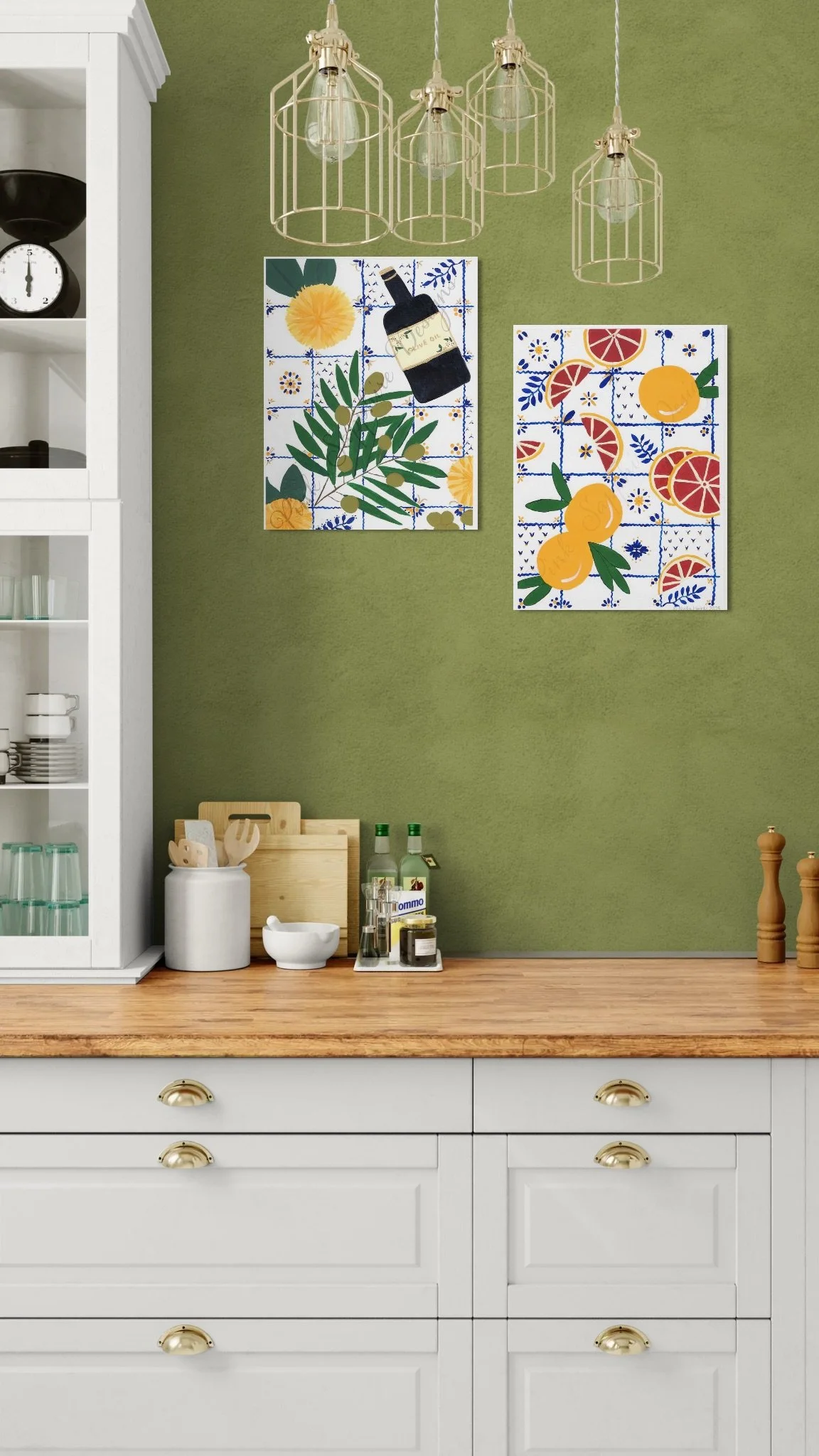
If you are ready to find that perfect piece that blends the timeless with the current, including the paintings depicted above, dive into the full Pink Sapphire Designs collection here.
Bringing the Botanical Beauty Home: Color and Texture from a Day Trip
I'm in the process of building new design collections for my portfolio. To get started on the planning, I decided I needed some fresh inspiration, so a few weeks ago I played tourist in my own city and took a trip to the local Botanical Gardens. What an adventure! The gardens are absolutely breathtaking in the early fall.
I'm in the process of building new design collections for my portfolio. To get started on the planning, I decided I needed some fresh inspiration, so a few weeks ago I played tourist in my own city and took a trip to the local Botanical Gardens. What an adventure! The gardens are absolutely breathtaking in the early fall.
I arrived just as they opened on a quiet Friday morning to avoid the crowds. The sun was bright and the air, still a bit warm, carried the crisp scent of late September.
The Unexpected Palette of Shade
The initial stretch of the trail was a welcome relief, covered completely in shade. It was here that I discovered an unexpected bounty of color. I had no idea there were so many vibrant, shade-loving plants!
Several garden beds were overflowing with variations of the beautiful Coleus plant. Their leaves showcased rich, velvety burgundy fading into a bright, acidic lime green at the edges—a stunning color clash that somehow feels perfectly grounded and balanced.


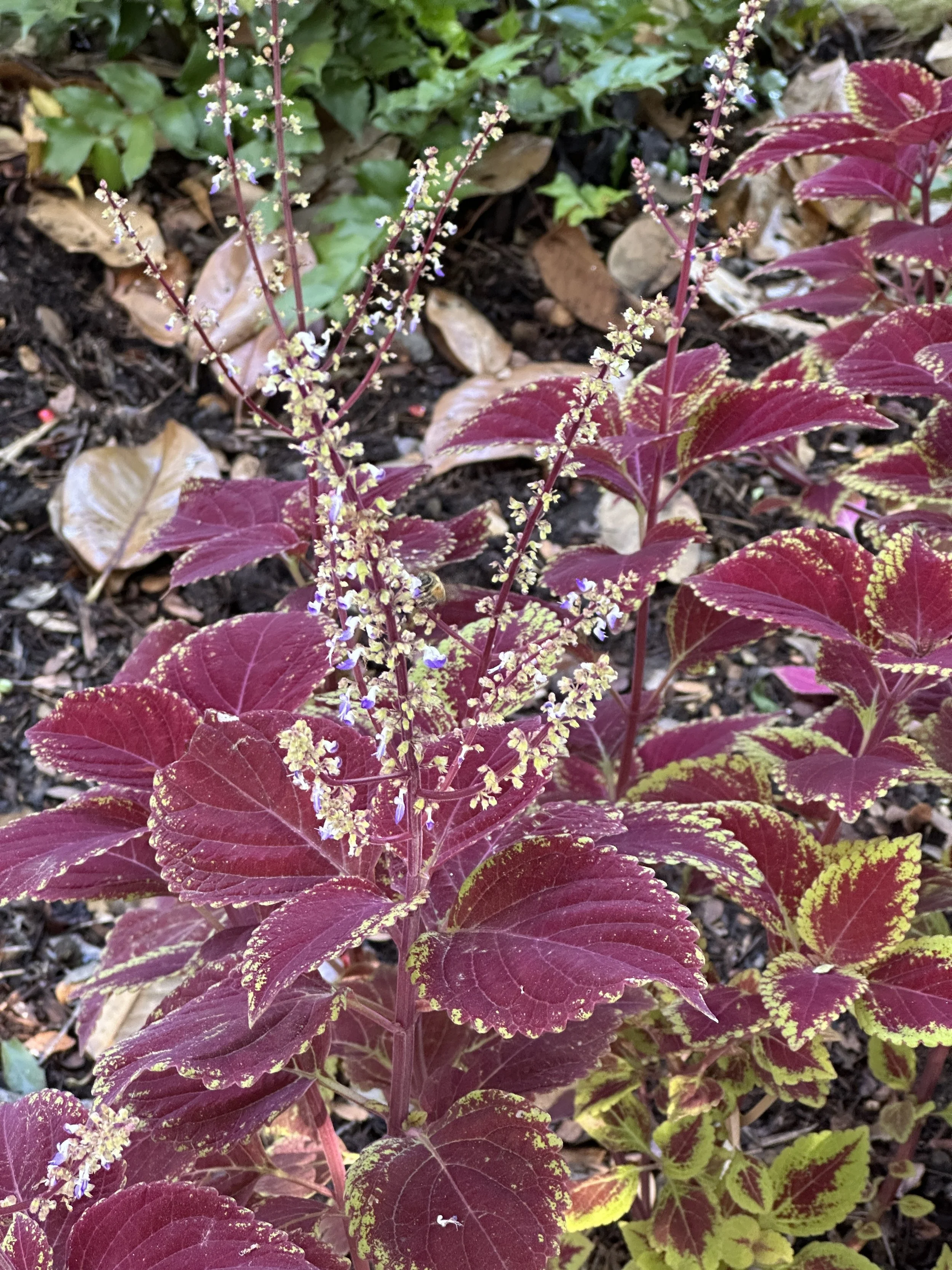
This specific contrast between the deep and vivid color is exactly the kind of inspiration I’m excited to translate into home decor. I immediately pictured these designs becoming a luxurious bedspread, bold wallpaper, or a trailing curtain pattern.
A Symphony of Shape and Texture
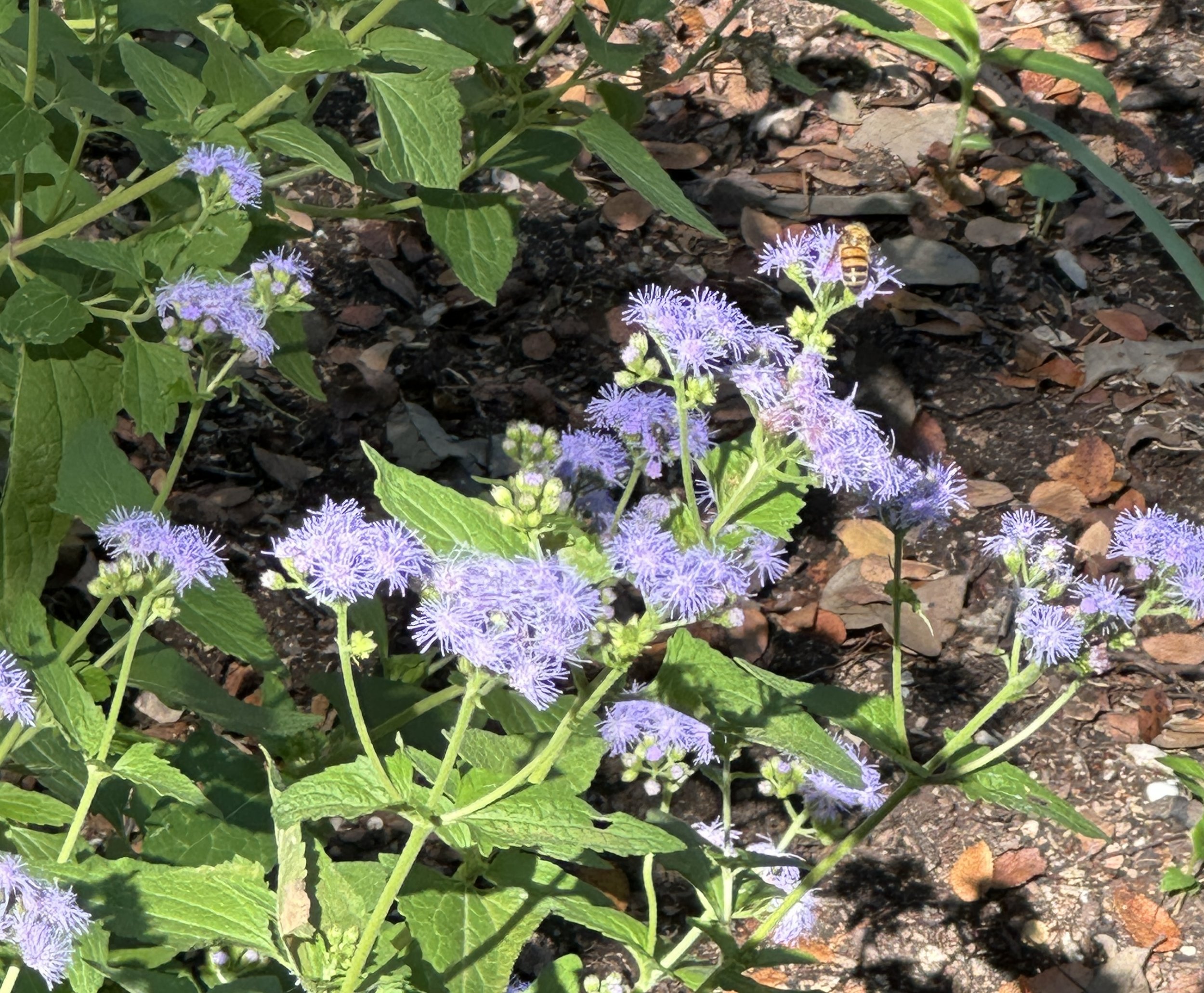
As the path opened up, the air became thick with the buzz of pollinators in the butterfly garden. Everywhere I looked, I found incredible texture, shape, and vibrant color that begged to be immortalized on canvas or fabric.


One plant, the Red Roselle, with its glossy, deep crimson pods, instantly reminded me of a classic, trailing wallpaper motif—organic yet tailored.
Further along, the delicate, wispy white threads of the Cat’s Whiskers (pictured on the left, below) contrasted beautifully with the tight, jewel-toned globes of the Globe Amaranth (pictured right, below). Imagine a playful serpentine pattern mixing these two textures for a lively powder room wallpaper.


The Grand Finale: Finding Serenity
The most surprising discovery of all had to be the stunning waterfall tucked away right in the middle of the city. Seeing the rushing, silvery white water cascade over the mossy, dark rocks was absolutely breathtaking. It provided a moment of calm and serenity, a quiet anchor to all the vibrant life I’d just experienced. This contrast between the bold energy of the flowers and the quiet power of the water is the core feeling I want to capture in my newest art.

What Will You Bring Home?
The best part of a day like this isn't just the memory—it's the fuel for creating a truly curated home. I've left the gardens with 250 pictures and an entirely new vision for color palettes and artistic textures that I know will resonate with your desire for timeless, inspired decor.
Keep reading this blog! In the next article, I'm peeling back the curtain to show you the botanical pattern directly inspired by this trip and how I'm developing it for print.