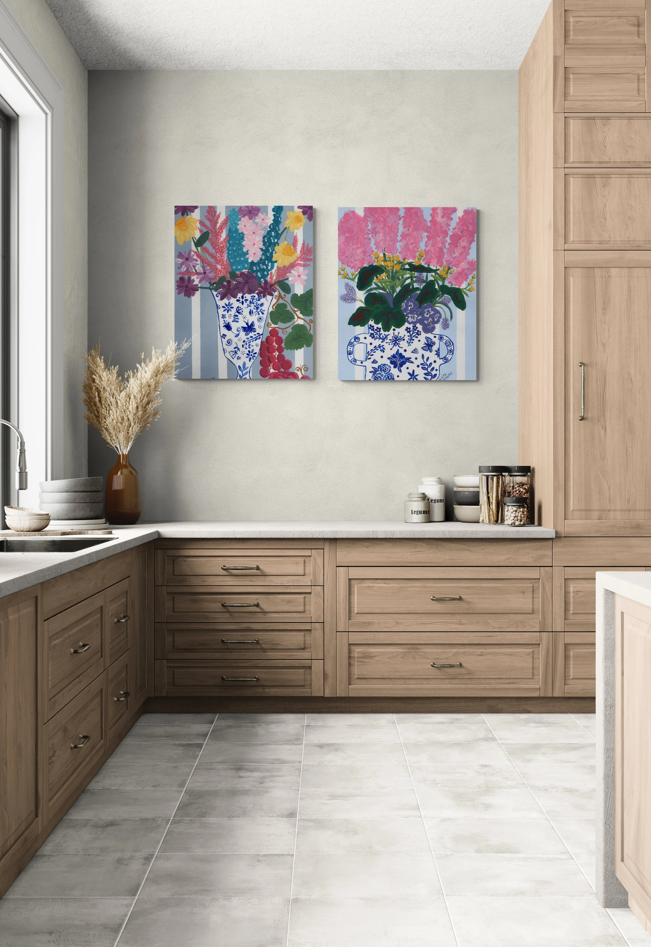
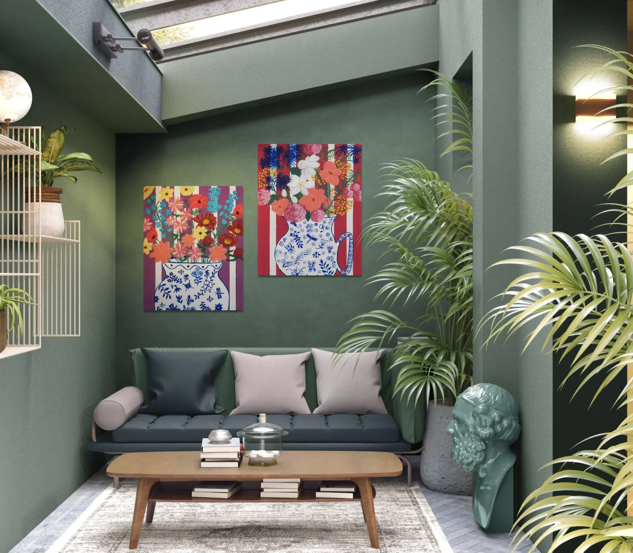
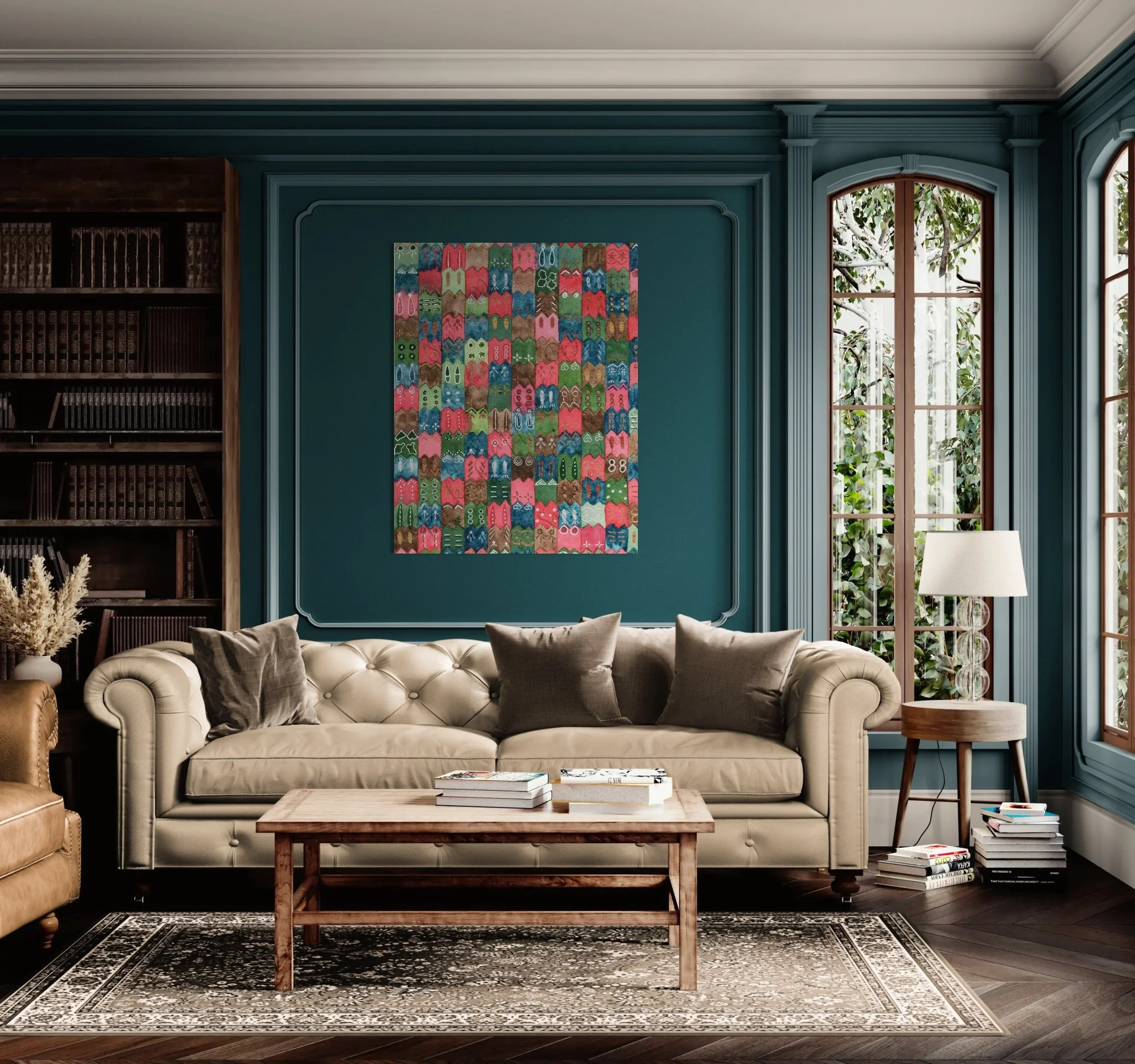
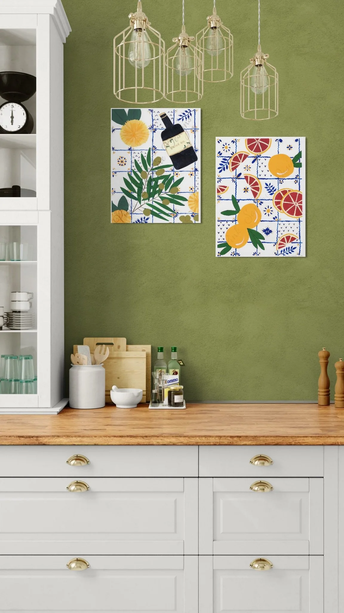
The Antidote to a "Beige" World + A Guide to Mixing Patterns Like a Pro
We’ve all seen it, and maybe even lived it at one point or another in our lives—the endless scroll of "sad beige" interiors and sterile grey palettes. They often come to our homes by way of new construction as "builder beige," or because the seller believes it's easier to sell a neutral colored home when it's put on the market, or maybe you've been told that neutral colors in a minimalistic palette is calming and cozy.
While all of these things are true, for many of us, they can feel a bit... well, soul-hushing. And, I would argue that, as someone who views art and color are as necessary as breathing, you can achieve the same goals-appealing to many new potential home buyers and creating a calming and cozy feeling - without excluding color from your home. I believe your home should be more than just a quiet space; it should be a vibrant sanctuary that refills your cup after a high-pressure day.
Now, this doesn’t mean your home needs to be pattern-drenched to be full of life; but the intentional use of color and pattern mixing to evoke a specific feeling the moment you walk through the door, can go a long way to breathing life into an otherwise neutral palette making your home the place you would relish spending time in.
In my latest collection, Pollinator Paradise, which I shared with you last month, I didn't just pick colors that looked "nice"—I chose a Toasted Lemon to mimic the bright energy of a Saturday morning and blues and teals to provide that "relaxing respite" we all crave before the chaos of the week comes calling. When you stop decorating for "trends" and start decorating for your own joy, you aren't just filling a room; you're curating an escape.
Now if you’re thinking, “but Nydia, you’re an artist and have experience pairing colors together in ways that can evoke certain feelings. I don’t know a warm color from a cool color and don’t want my home to look garish or gaudy.” I totally understand. My recommendation is to start small.
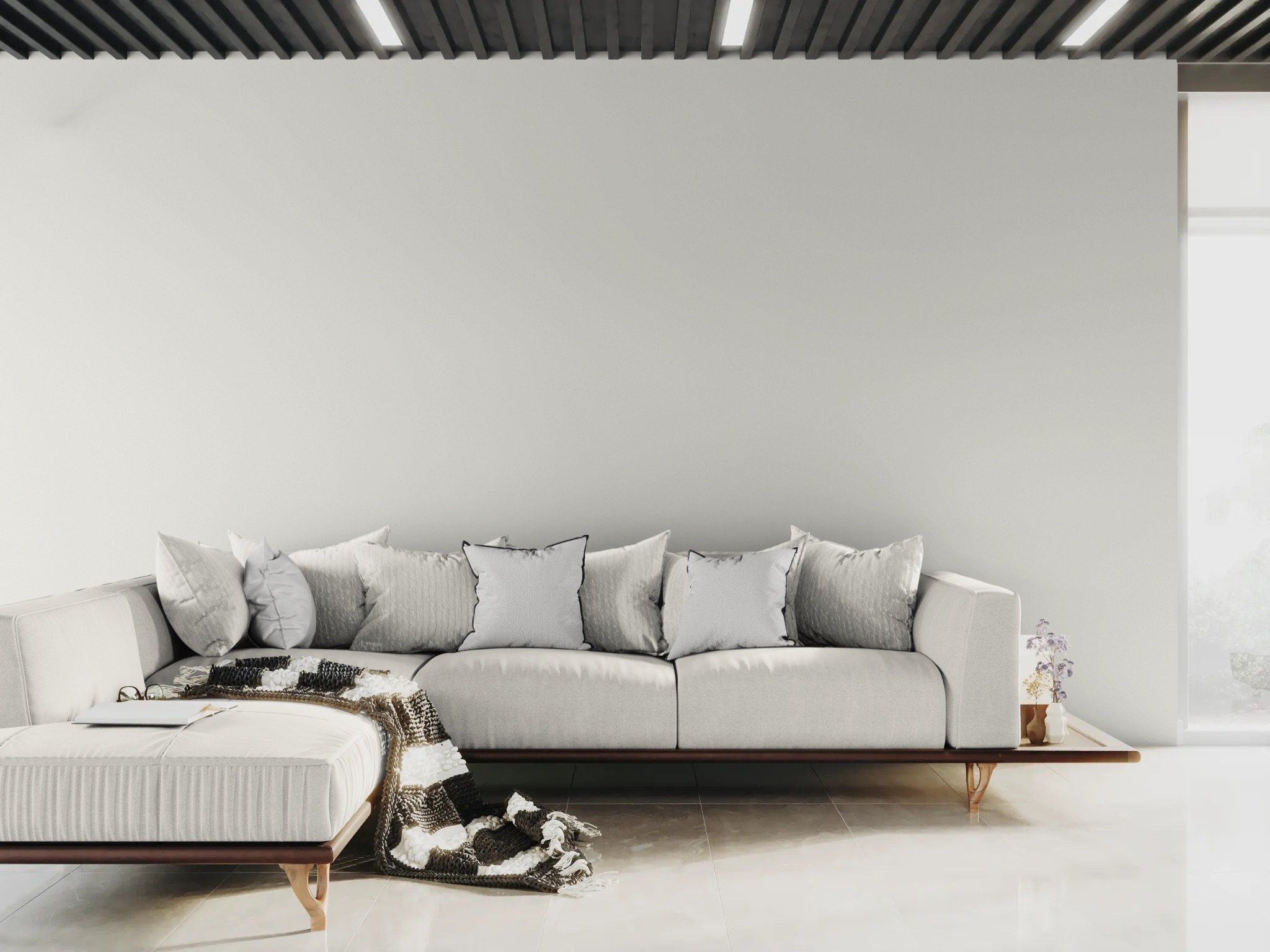
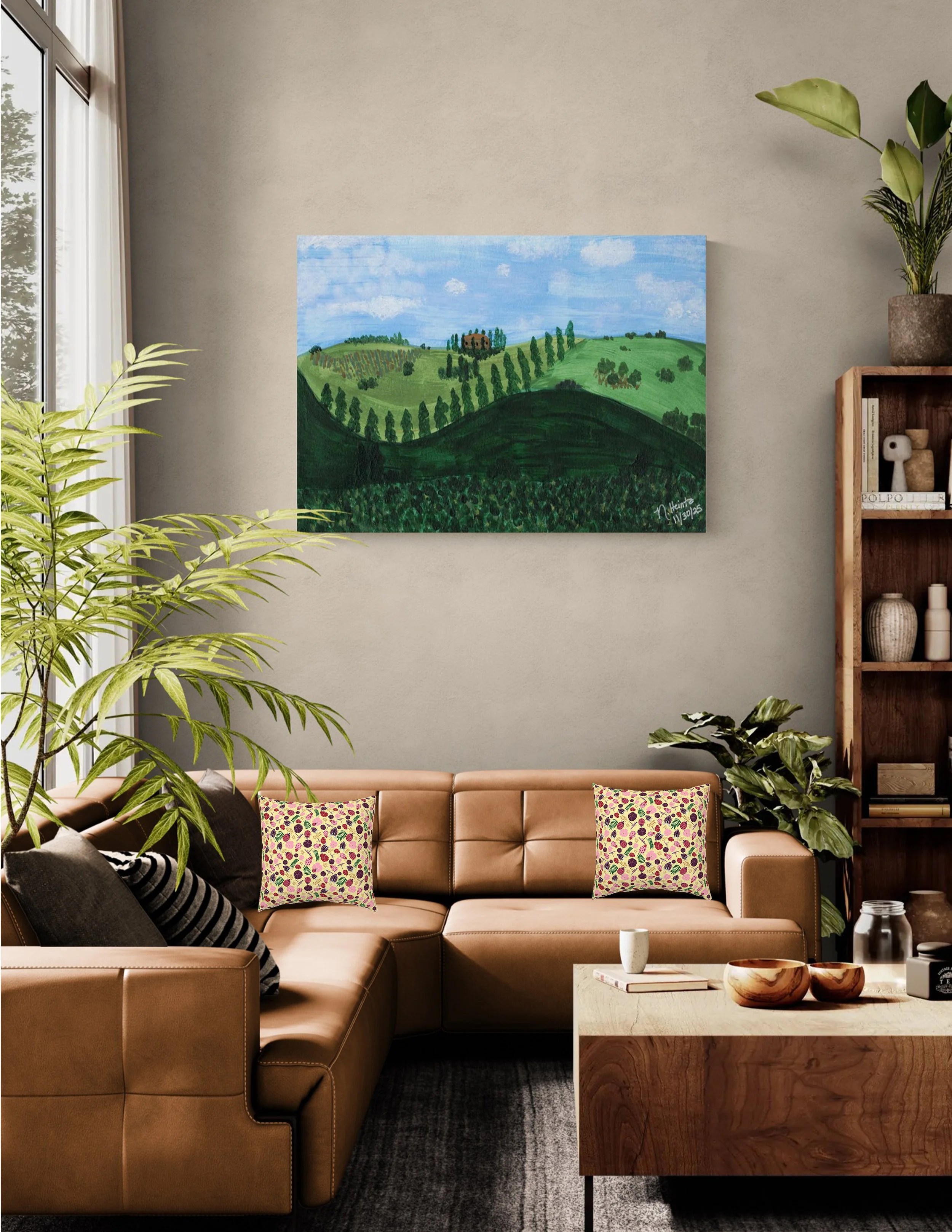
Experiment in a powder room or a reading nook, or simply try spicing up a solid-colored arm chair or couch with brightly colored or patterned throw pillows. See how the addition of the teal from my Hibiscus Breeze pattern on the pillows in the grey room above adds a little pop while keeping the room feeling calm. In the room below, my Garden Gala design on the pillows against the warm brown of the couch adds a ray of sunshine to the room while the ladybugs and dragonflies in the pattern add just a touch of whimsey.
Ready to move beyond the beige?
If you’ve ever felt overwhelmed with color and pattern mixing or worried that too much of either will look like a mess rather than a masterpiece, I’ve created something just for you.
[Download the Pink Sapphire Guide to Pattern Mixing Like a Pro]
In this free 4-page PDF, I’m sharing my design secrets for mixing patterns and adding color to your home and textile projects with confidence. Whether you’re a Mindful Maker planning your next sew or a Home Curator looking to refresh your table linens, this guide will help you use the "Rule of Three" among other helpful tips to build a palette that feels as soulful and layered as your favorite memory.
5 Design Tips to Bring Balance and Harmony to Your Home
Creating a sanctuary that reflects your personal style...
I’m so happy you’ve decided to join me as we explore ways to infuse your everyday life with a little more charm and elegance. Whether you are looking to refresh a single corner or your entire living space, these five tips will help you elevate your décor:
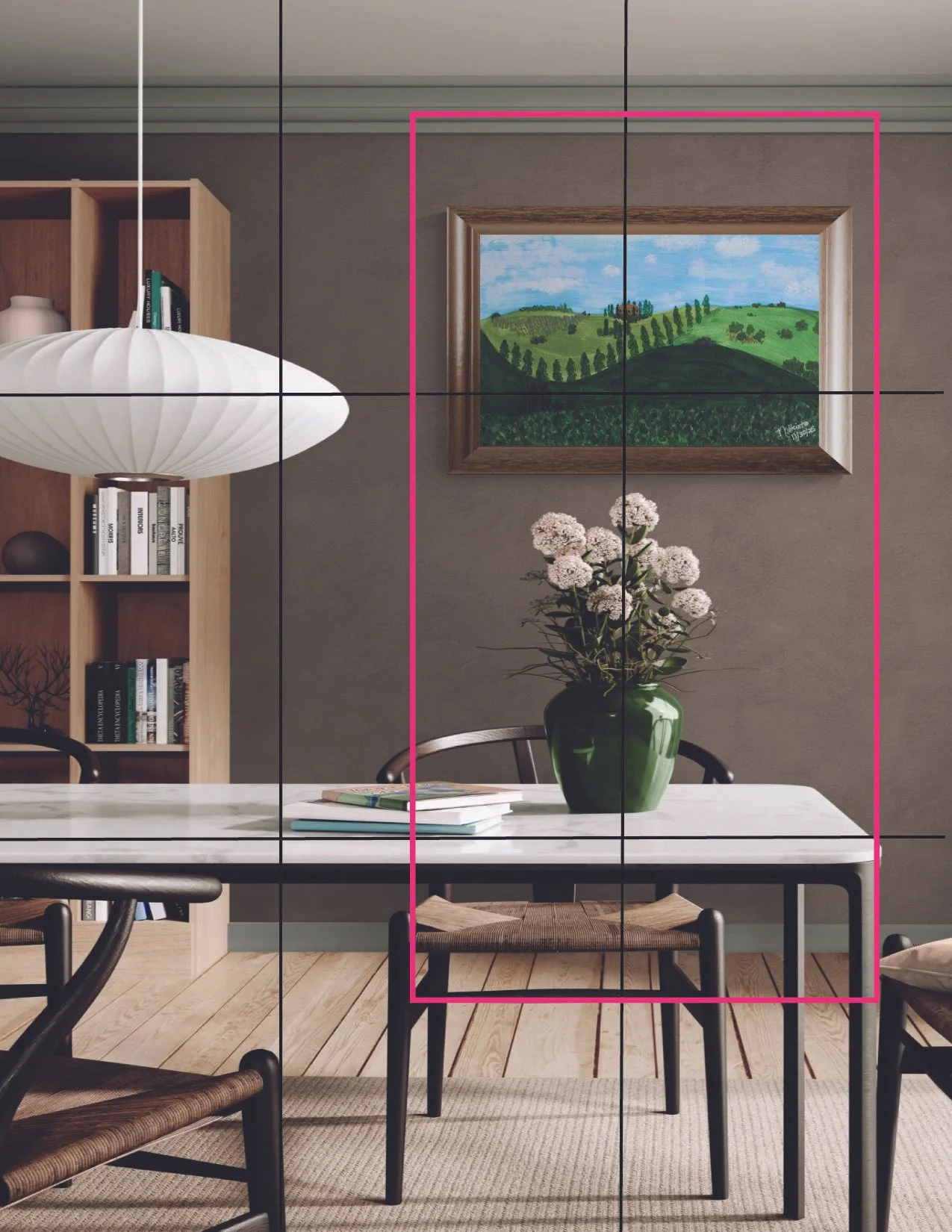
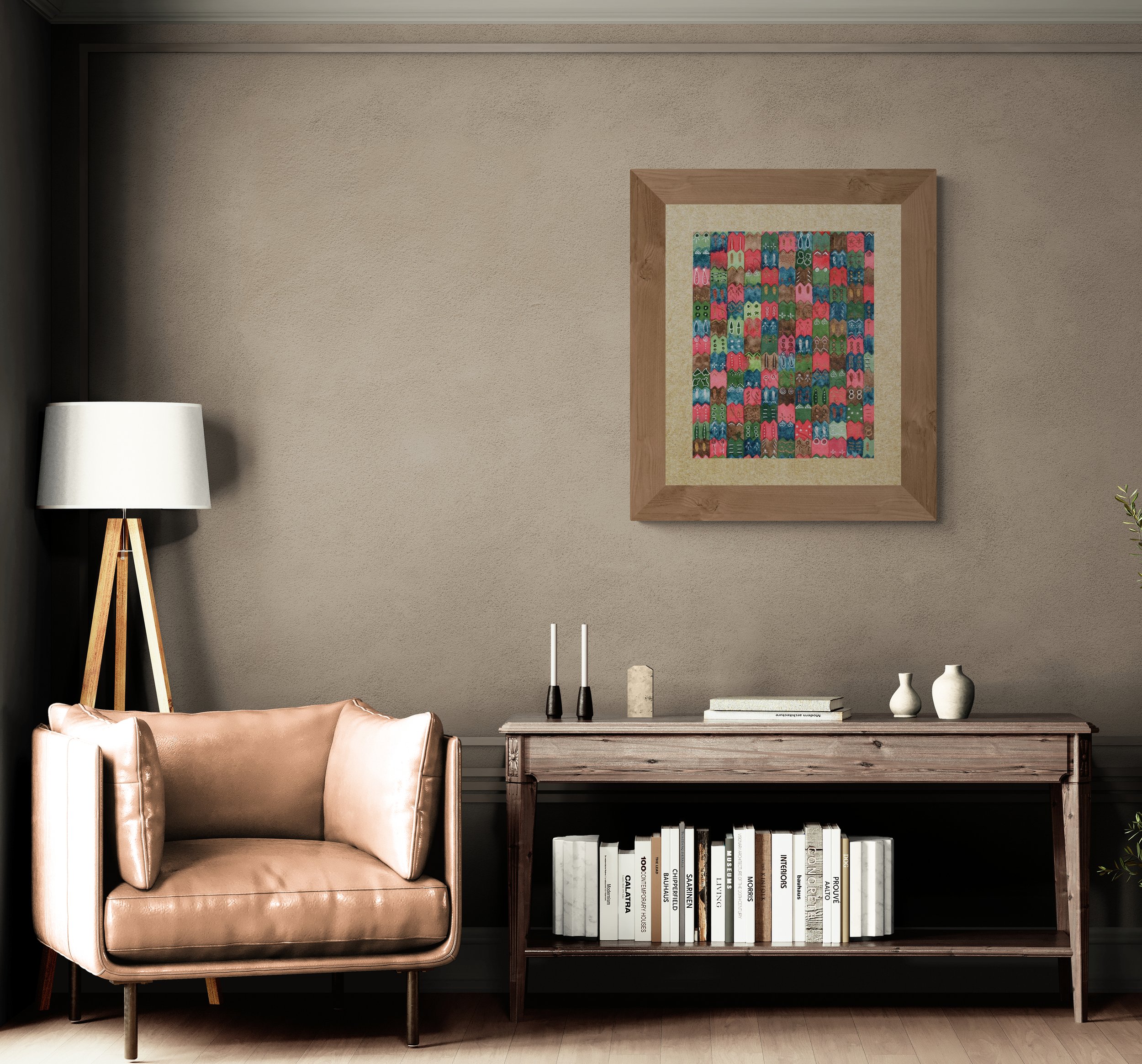
Follow the Rule of Thirds: This is a delightful secret for creating visual harmony. Instead of placing your favorite vase or painting right in the center, imagine the space divided into nine equal parts by two vertical and horizontal lines, like a tick-tack-toe board. Try placing your focal object along one of those lines. Doing so creates a sense of balance that feels much more interesting and organic as in the image below.
The Power of Triangles: Another way to achieve a similar, sophisticated outcome is to position objects in the shape of a triangle. This simple trick gently leads the eye around the room, making your space feel curated and thoughtful.
Identify Your Focal Point: Think about the first thing you want people to see when they enter a room. Is it a vibrant piece of art or a cozy reading nook? If the eye is not naturally drawn to your chosen focal point using the design tricks above, you can also use the power of "leading lines." These are objects such as rugs, furniture, molding, the stripes in the flooring, objects intentionally grouped into a line, or even empty spaces that can lead the eye in a particular direction toward your intended focal point.
Balance with Visual Weight: Think of visual weight as the "presence" an object has in your room. A vibrant, patterned pillow might occupy the same physical space as a solid grey one, but its "weight" is much greater because it captures our attention and brings joy to the eye. To keep your space from feeling lopsided with a bold piece of art, try balancing it with a physically larger, neutral element—like a creamy armchair—on the opposite side to create a sense of grounded elegance.
Contrast and Texture: To truly elevate your décor, think about how light interacts with your surfaces. I love mixing "light-absorbing" textures, like a soft wool throw, with "light-reflecting" surfaces, like a glass-top table. This interplay between matte and shine creates an enchanting depth that makes any room feel curated and sophisticated, yet perfectly cozy.
Applying these design principles is such a joy when you have a piece that truly speaks to you.
Why My Art Is More Than Decor (And How It Changes the Way a Home Feels)
January has a quieter energy.
The decorations are packed away, routines settle, and we finally have space to notice something important—not just how our homes look, but how they feel.
This is where the story of Pink Sapphire Designs truly begins.
January has a quieter energy.
The decorations are packed away, routines settle, and we finally have space to notice something important—not just how our homes look, but how they feel.
This is where the story of Pink Sapphire Designs truly begins.
I Didn’t Start Making Art to Decorate Walls
I didn’t begin painting with the goal of filling empty spaces.
In fact, my home already looked “nice.” It was tidy. Thoughtfully put together. Neutral and safe.
And yet, something was missing.
The rooms didn’t feel personal or reflect my personality. They could have belonged to anyone. That quiet disconnect—the feeling that a space looks finished but feels empty—is what led me to paint.
Pink Sapphire Designs was born from the desire to create art that brings life back into a home.
Art Isn’t Meant to Match Your Sofa
Somewhere along the way, art became an afterthought in home design. Something chosen last. Something meant to blend in.
But art is meant to do the opposite.
Art should anchor a room.
It should set the mood.
It should introduce color, depth, and story.
When you begin with a meaningful piece of wall art, everything else falls into place more naturally. Color palettes make sense. Styling becomes easier. Rooms feel layered instead of cluttered.
This is how designers create homes that feel curated rather than copied.
Why Hand-Painted Art Feels Different
Every Pink Sapphire Designs piece begins as an original watercolor or acrylic painting.
Brushstrokes are visible. Texture is intentional. Imperfections are welcome.
That’s because those details are what give art warmth. They’re what make a piece feel human—like it was made slowly, with care.
Hand-painted art brings presence.
When Art Becomes a Memory
The inspiration behind my work comes from places and feelings that linger—Tuscan landscapes, Mediterranean tiles, botanical studies, heirloom ceramics.
I’m drawn to travel and nostalgia, to the beauty of collected objects and layered interiors.
My goal is for art to feel like a memory.
Something familiar, even if you’ve never been there.
Because the most beautiful homes aren’t the ones chasing trends. They’re the ones that reflect the people who live inside them.
Midnight Blooms: Art for Rooms That Crave Depth
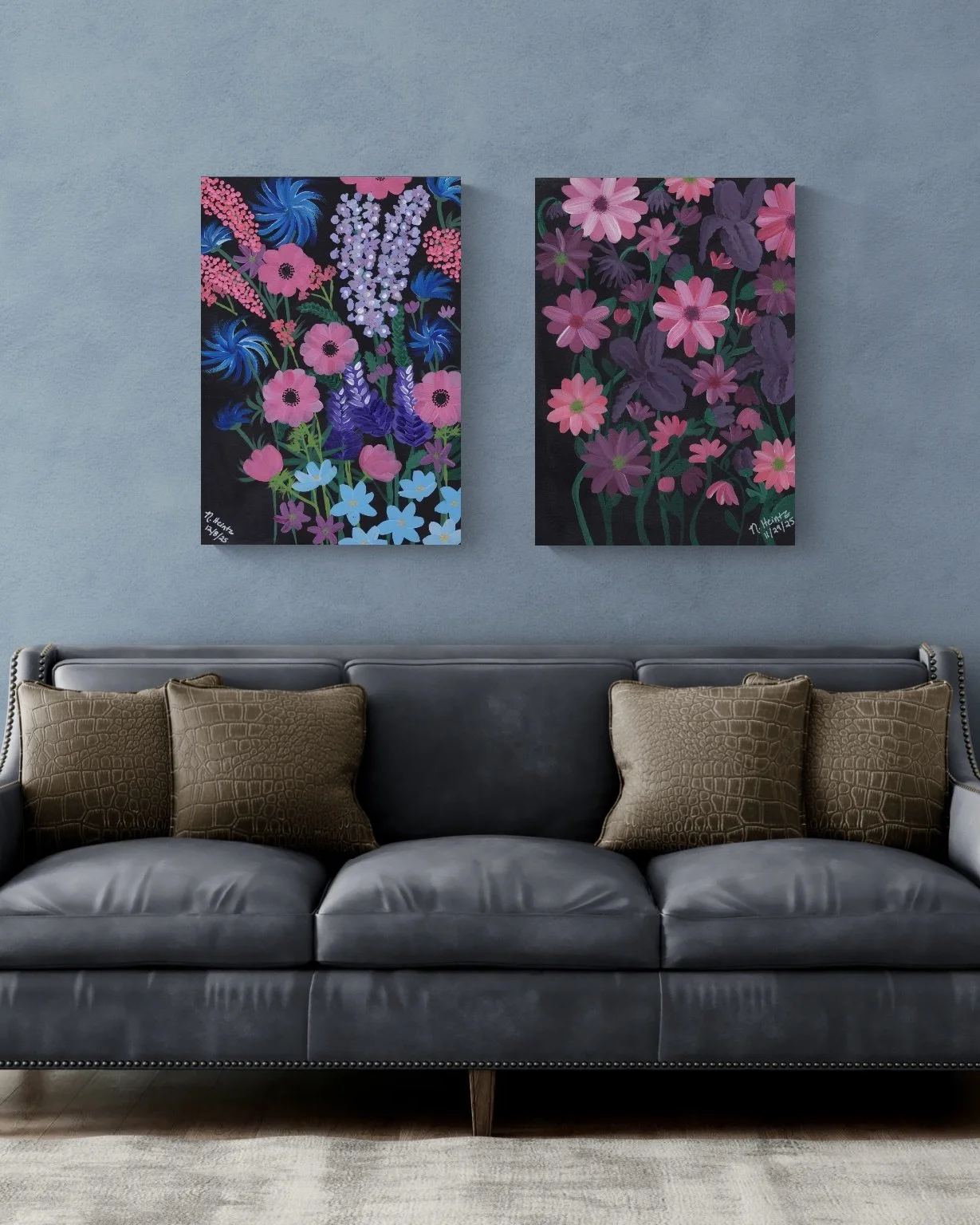
This season, I introduced Midnight Blooms—a two-piece wall art collection designed for rooms that want quiet drama and richness.
Moody florals. Deep, layered color. A sense of stillness and intention.
The two pieces can be styled together as a diptych to create instant impact, or displayed individually in smaller spaces that need presence—entryways, dining rooms, bedrooms.
Midnight Blooms was created for homes that don’t need brightness, but want character.
Bringing Soul Back Into Your Home
If your home feels beautiful but unfinished, it may not need more furniture.
It may need art with meaning.
Art that anchors the room.
Art that tells a story.
Art that makes your space feel lived-in, loved, and unmistakably yours.
That’s what I create at Pink Sapphire Designs—hand-painted wall art for soulful homes and everyday living.
If you’ve been waiting for something that finally feels right, you’re in the right place.
Pantone Color of the Year - 2026
December is always one of my favorite months. It’s when we wrap up the year in a cozy blanket of reflection and look ahead to fresh, exciting new beginnings. And for the creative world, December also means the highly-anticipated announcement of the Pantone Color of the Year!
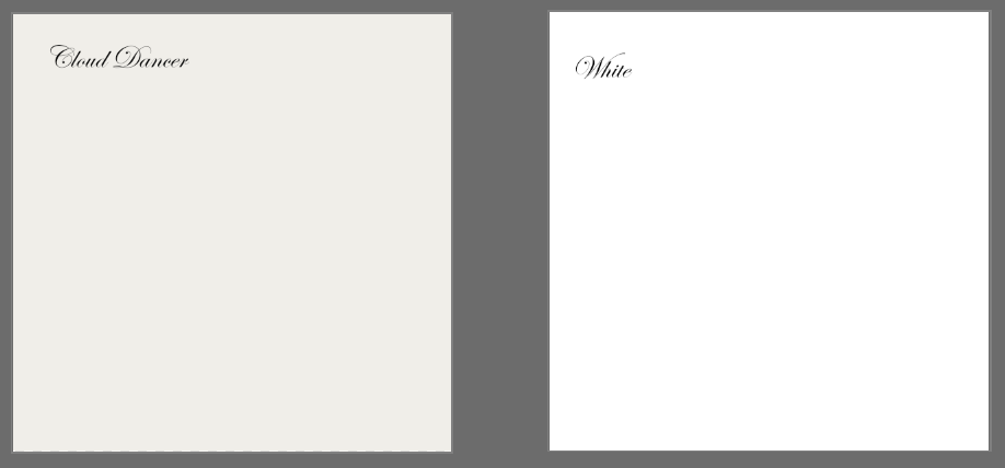
This year, the choice is simple and sophisticated at the same time. The Color of the Year for 2026 is: Cloud Dancer (PANTONE 11-4201). It's not pure white as you can see below. It's described by the Pantone Color Institute as, "a lofty white neutral."
How Cloud Dancer and White Compare to Each Other
It perfectly aligns with our mission here at Pink Sapphire Designs to infuse everyday life with charm and simplicity.
Before we dive into why this particular white is a game-changer, let’s cover the basics.
Who (or What) is Pantone, Anyway?
You might hear the name Pantone thrown around in design circles or you might never have heard of them at all, so what exactly are they? The Pantone Color Institute is essentially the global authority on color. Back in the 1960s, they invented the Pantone Matching System (PMS), which is a standardized color language. Think of it as a dictionary where every single shade has an exact, universal number. This allows artists like me, designers, and manufacturers all over the world to communicate colors precisely, ensuring that the vibrant pink you see on your screen is the exact same pink that shows up on a printed fabric or product.
The Purpose Behind the Color of the Year
The Color of the Year isn’t picked randomly. It’s a deep dive into global culture, art, fashion, technology, travel, and societal mood.
The purpose is to capture the essence of what people are collectively seeking for the year ahead and to signal a direction for the design industry. In short, it’s a forecast for the color palette that will dominate runways, home décor, product design, and—yes—surface pattern design, for the next 12 months.
How Do They Pick the Color of the Year?
A secret group of color experts at the Pantone Color Institute travel the world, keeping their fingers on the pulse of global events and trends. They don’t just look at what’s popular; they analyze what is missing and what people need emotionally.
Cloud Dancer is a perfect example of this. In a world that can feel loud and chaotic, this soft, "billowy" white is the visual equivalent of a gentle breath. Pantone chose it to represent a collective desire for clarity, serenity, and a fresh start—a clean slate to invite joy and creative focus back into our lives.
Cloud Dancer is especially noteworthy because it is the first white tone to ever receive this designation. As you saw from the swatch above, it’s a beautifully balanced white—not stark and cold, but naturally warm and airy, like the cozy feeling of freshly washed linens under a bright sky.
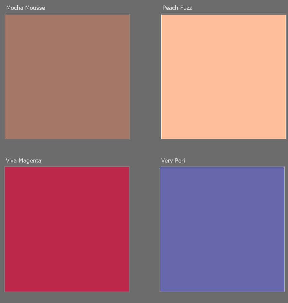
This serene shade follows some truly vibrant and engaging colors. Below are the colors chosen for the last few years:
What Cloud Dancer Means to You
As an artist and surface pattern designer, this is where the real fun begins! Cloud Dancer is the foundation that allows everything else to shine. You will begin seeing it used in fashion, branding, and home decor items world wide.
For the Surface Pattern Lover: Think of your favorite vibrant pattern—a floral, a playful geometric, or a lush botanical. When set against a soft, generous neutral like Cloud Dancer, your pattern will feel more balanced, sophisticated, and clean. It provides the charming backdrop that lets the colors in the design truly pop!
For Your Cozy Home: This is the perfect shade to use as an accent in your home décor. Use it in textiles, wall art, or ceramics to bring that feeling of quiet reflection and spa-like serenity into your favorite spaces. Because it's a neutral color, it will easily compliment many of the paint manufacturers' colors of 2026 that I shared last month, the darker shades, in particular. (If you missed it, you can reference that article here.)
For a Creative Reset: The message of Cloud Dancer is “clarity.” It’s an invitation to simplify, declutter, and open up space for new creative ideas. For me at Pink Sapphire Designs, this is my cue to explore new pattern ideas with a focus on fresh, clean layouts that still have plenty of joy and color!
I hope this inspires you to find your own cozy, new beginning in 2026!
Inspiration Corner: Finding Timeless Charm in the Colors of 2026
The unveiling of the annual Colors of the Year is always a delightful peek into the future of design. For 2026, major paint manufacturers have spoken, and the message is clear: we are moving toward thoughtful, grounded colors that prioritize warmth, serenity, and longevity. As you look to infuse your everyday life with charm, let’s dive into the common theme and explore how these timeless hues can inspire your next décor project.
From Grounded Greens to Rich Espresso: How the 2026 Colors of the Year Will Elevate Your Home
The unveiling of the annual Colors of the Year is always a delightful peek into the future of design. For 2026, major paint manufacturers have spoken, and the message is clear: we are moving toward thoughtful, grounded colors that prioritize warmth, serenity, and longevity. As you look to infuse your everyday life with charm, let’s dive into the common theme and explore how these timeless hues can inspire your next décor project.
2026 Colors of the Year, by Paint Manufacturer:
The 2026 Color Trend: Enduring Warmth
If we look closely at this delightful palette, the clear trend is "enduring warmth." The colors are heavily focused on deep, earthy neutrals and restorative greens, moving away from bright, saturated tones.
This trend encourages creating a warm, cozy interior that is refined and promotes a sense of grounded calmness—perfect for the homeowner who desires enduring style.
Art Pairing: The Best Colors to Complement the Trend
For walls painted in these sophisticated shades, the best art pairings should either offer high contrast or a complementary color family to bring life and coziness to the space.
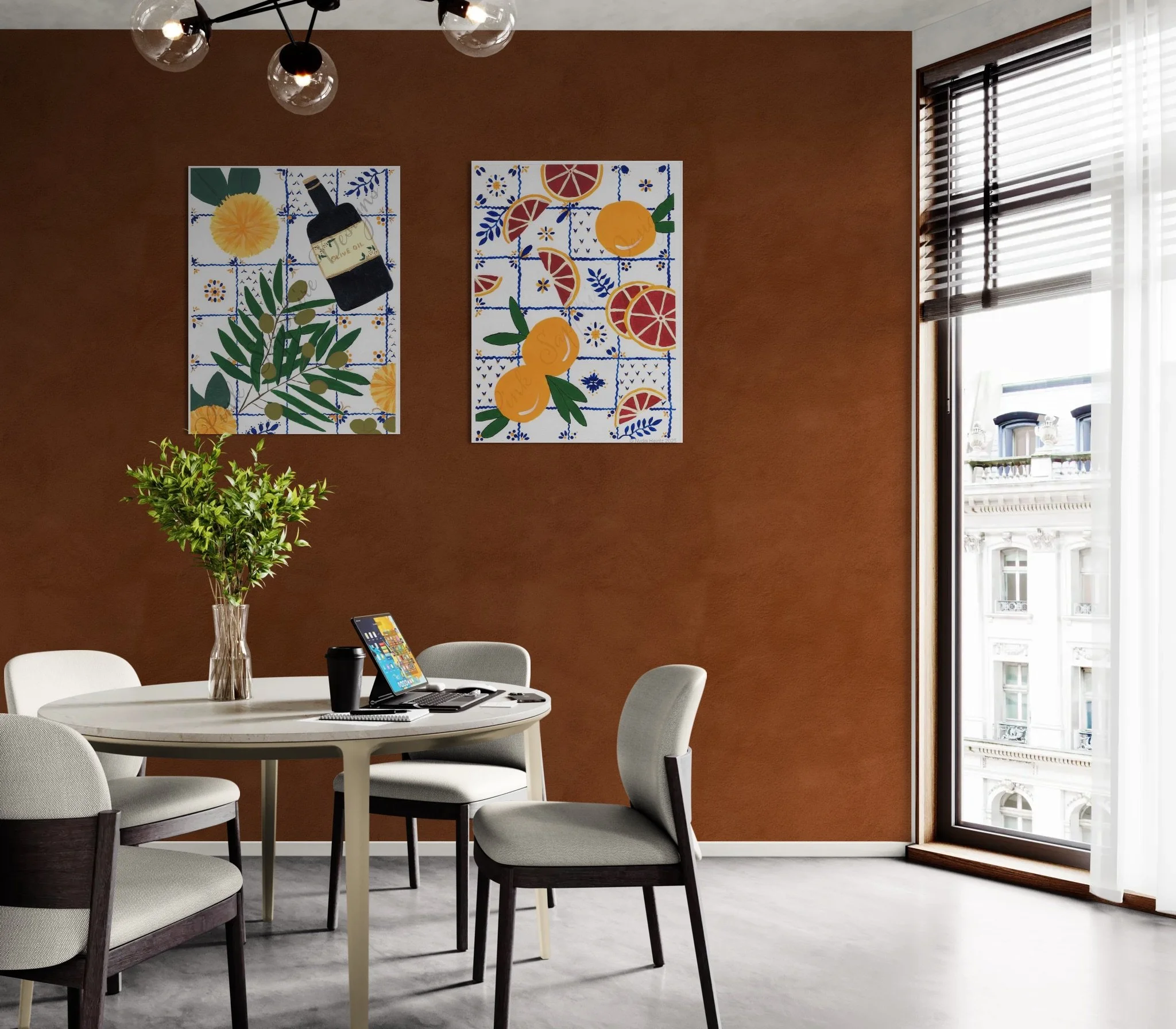
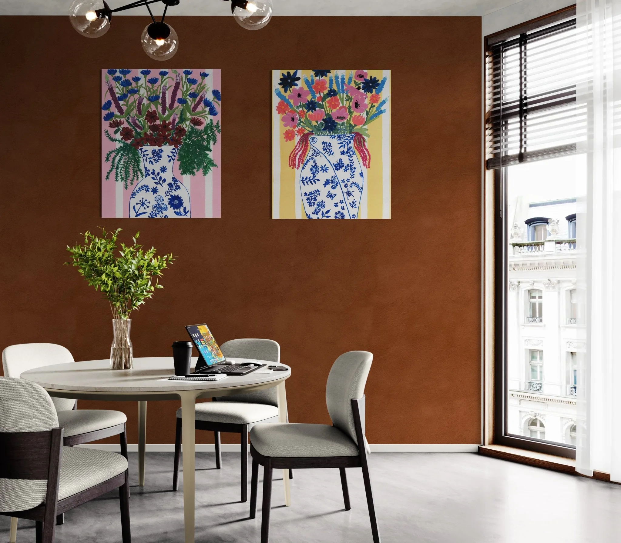
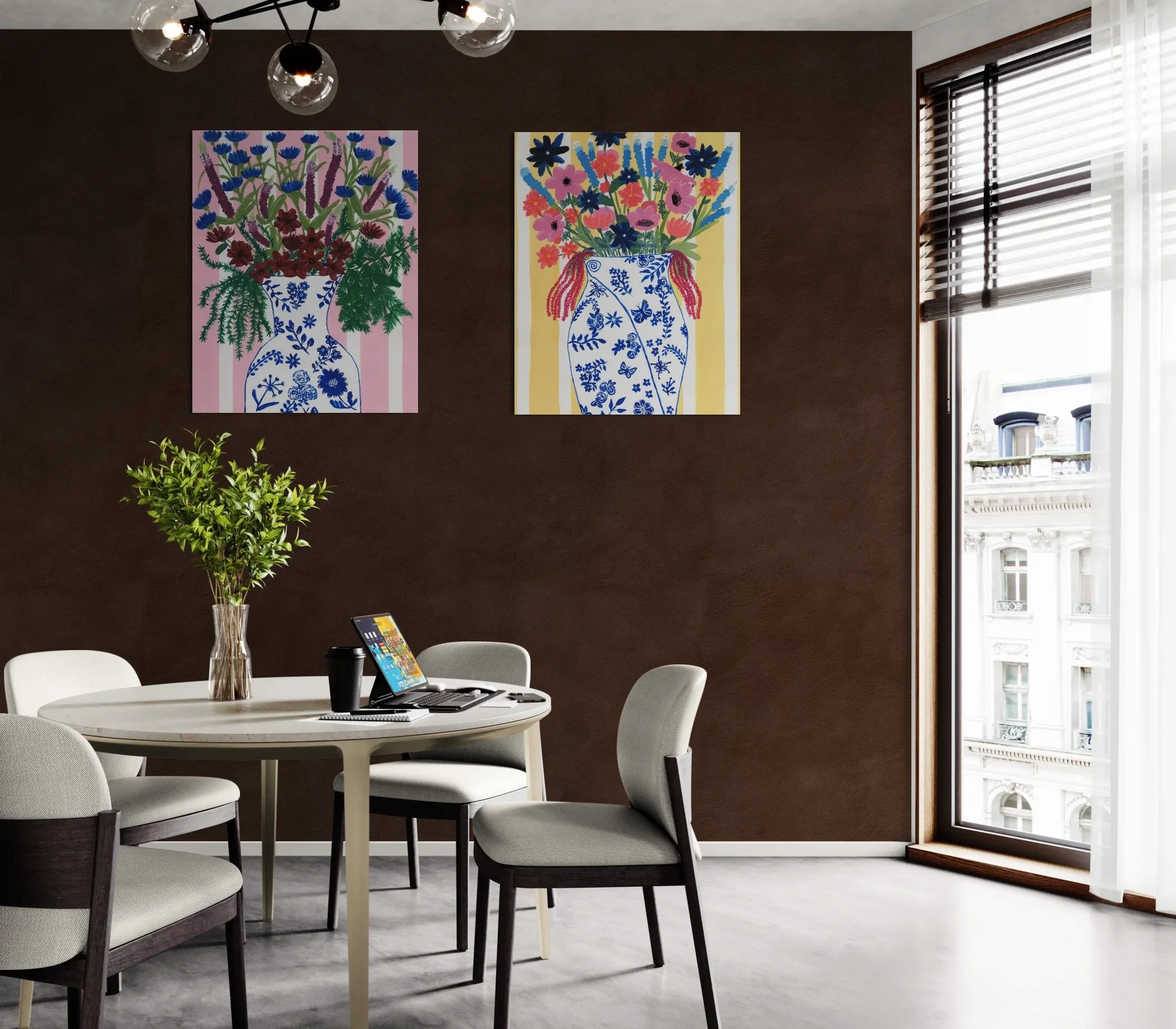
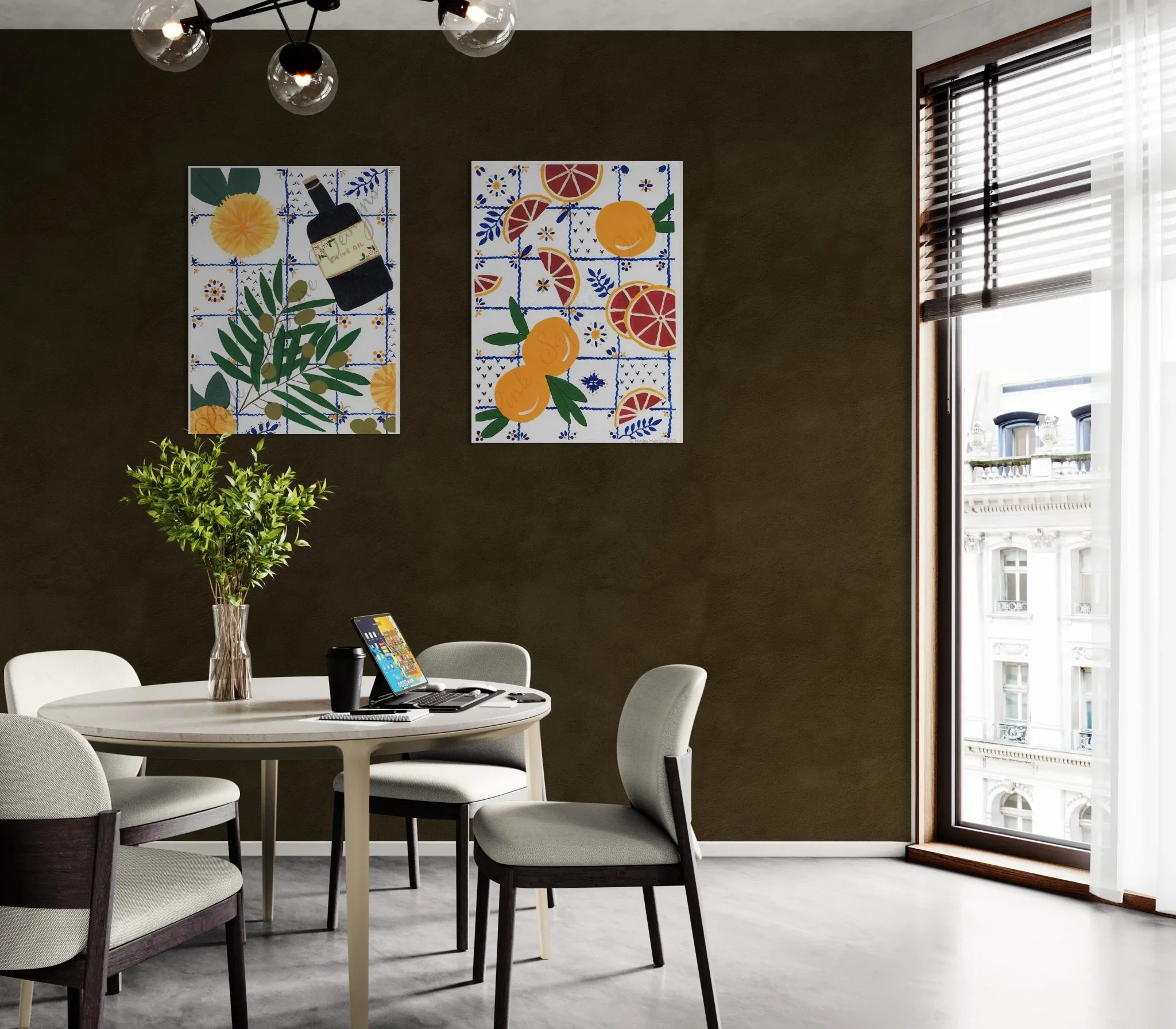
For Deep Walls (Silhouette [Espresso], Mahogany): Look for artwork with bright, vibrant yellows (like mustard or gold), crisp whites, or soft pinks. These colors will truly pop against the dark backdrop, adding a delightful energy and elegance. Alternatively, deep, rich greens, blues, and reds will provide a softer look.
For Neutral Walls (Khaki, Ivory): These walls act as a beautiful, timeless canvas. Seek art that features deep, beautiful blues, rich terracotta reds, or jewel-toned teals. This is the perfect opportunity to showcase pieces with complex color stories.
For Green Walls (Jade, Safari, Eucalyptus): Since these greens are already very calming and natural, art featuring warm, deep reds (like burgundy or merlot), pops of bright coral, or elevated botanical illustrations with white backgrounds will create a sophisticated, layered look.
✨ Finding Your Charming Art Pairing
This trend toward deep, earthy neutrals and restorative greens is a beautiful opportunity to create a warm, cozy interior that feels both refined and deeply personal. Remember, your home should reflect your unique charming style. Whether you are seeking a vibrant piece to truly pop against a dark wall or a canvas with a complex color story to elevate a neutral space, the goal is to create a space that is uniquly you. I’ve always believed that art is the final touch of joy that ties a beautiful room together.
Now, I'd love to hear from you—which of these 2026 colors are you most excited to bring into your home? Please reply to this post and let me know!
If you are ready to find that perfect piece that blends the timeless with the current, including the paintings depicted above, dive into the full Pink Sapphire Designs collection here.
How to Determine the Best Location, Size, and Placement for Your Wall Art
As a homeowner who values authentic, elevated décor, you know that the right artwork can transform a house into a truly charming and personal space. Yet, knowing exactly where to hang it and what size to choose can feel like a daunting challenge.
Let’s dive into some easy-to-follow guidelines that will help you perfectly place those thoughtful pieces and truly elevate your décor.
Determining the Perfect Size
The biggest mistake people make is choosing art that is too small for the space. To avoid this, think about how the piece relates to the furniture beneath it:
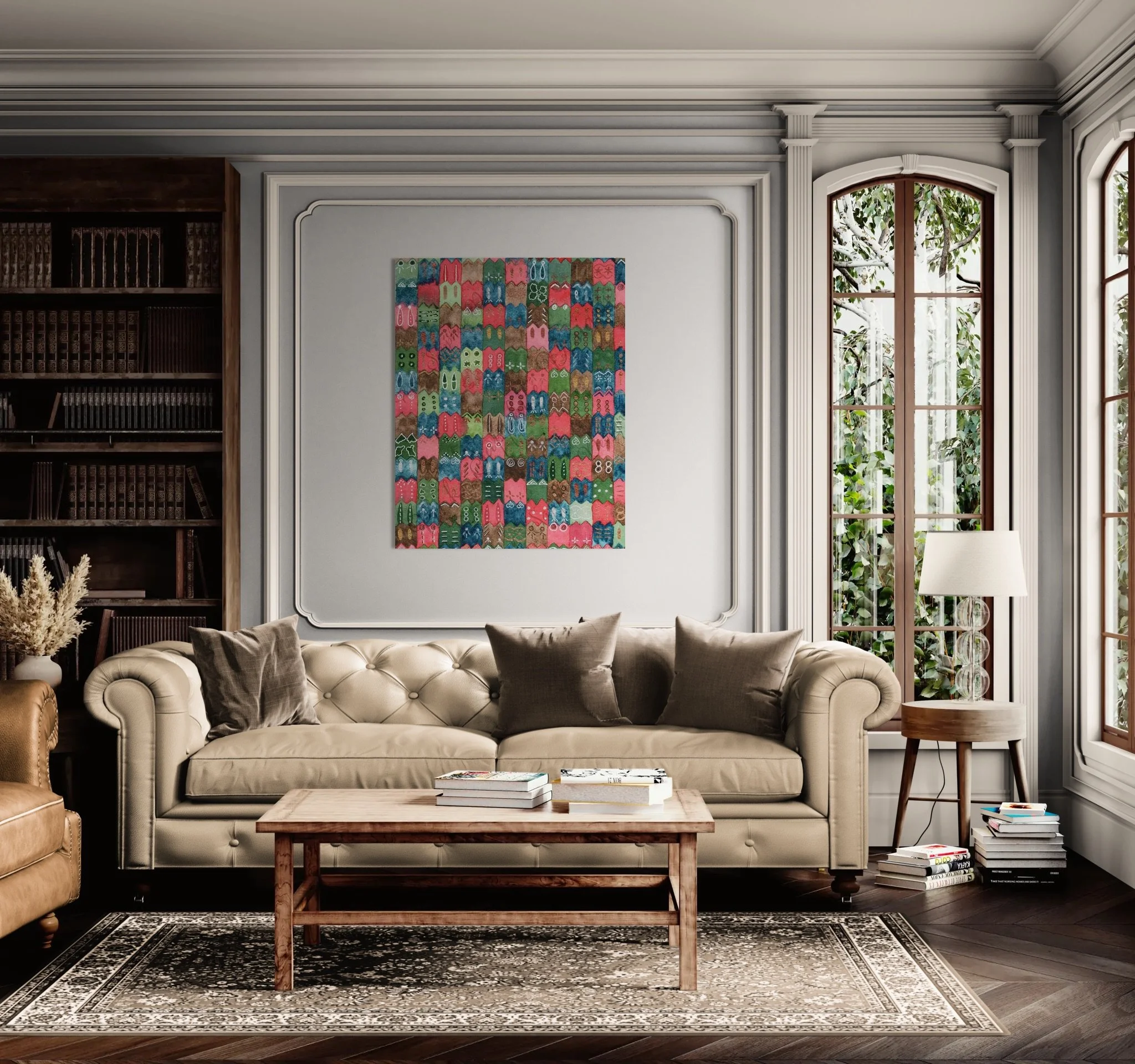
Above a Sofa or Headboard: The art should be approximately two-thirds the width of the furniture below it. This ensures the art and the furniture feel connected and balanced.
On an Empty Wall: If the wall is truly bare, the art should generally cover about 60% to 75% of the available wall space. Don’t be afraid to go big—a large piece adds drama and sophistication.
Gallery Walls: If you don't have large pieces of art to cover the wall, consider arranging a gallery wall. Group small pieces closely together (3–5 inches apart) so they read as one unified piece. Make sure to keep in mind the guidelines above for gallery walls as well.
The Rule of the Eye: Placement Height
To ensure your art is enjoyed effortlessly, focus on hanging it at eye level.
Standard Placement: The center of the artwork should be approximately 57 to 60 inches from the floor. This height is considered the average human eye level and is what museums use.
Over Furniture: If you’re hanging the piece over a sofa or credenza, the bottom edge of the frame should be hung 6 to 12 inches above the top of the furniture. This allows the two elements to relate without looking crowded (and keep you from touching your head on them if you lean back while sitting on the couch or chair below).
Location Tips for Lasting Charm
Living Room: This is often the anchor of your home, making it the ideal spot for your most impactful, statement pieces. Use art to define conversation areas.
Dining Room: A space for thoughtful conversation and joy. Art here can be a little more decorative or abstract, adding a vibrant touch without dominating the meal.
Kitchen/Bathroom: When using art in these spaces, make sure the pieces are framed behind glass or sealed to protect them from moisture and steam.
By following these tips, your wall art is sure to elevate your space.
From Garden Inspiration to Art: The Making of a New Fall Pattern
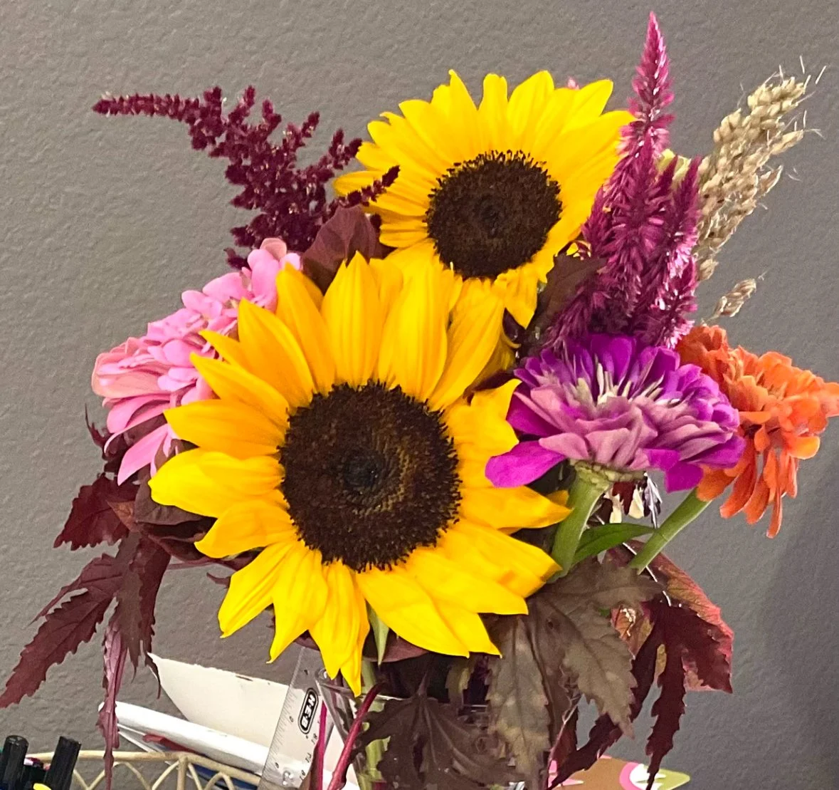
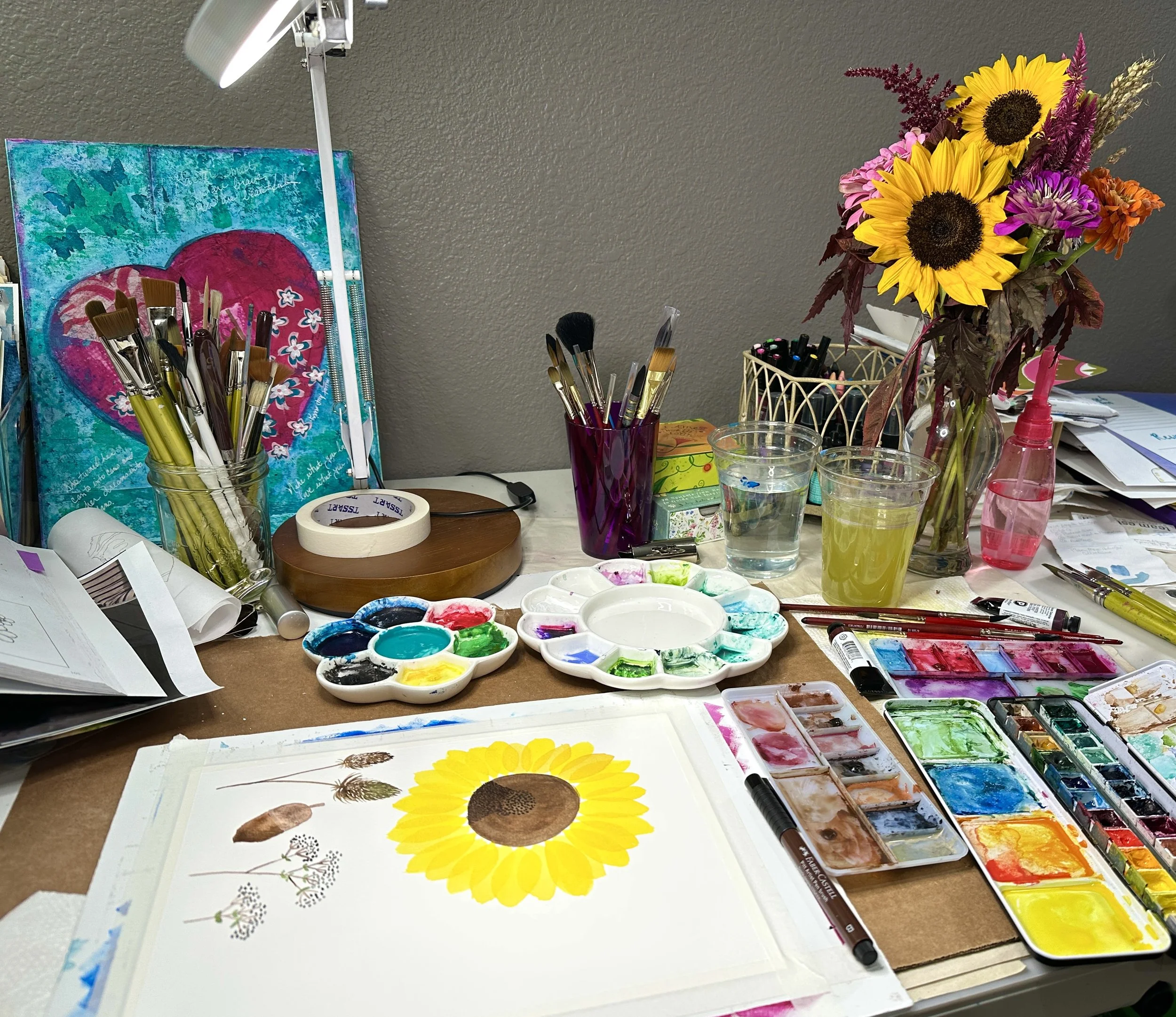
The trip to the botanical gardens last month was so inspiring, I couldn't wait to get back to my studio. Since you aren't allowed to pick the beautiful blooms there, I stopped on my way home and picked up a fresh bouquet for my art table.
The trip to the botanical gardens last month was so inspiring, I couldn't wait to get back to my studio. Since you aren't allowed to pick the beautiful blooms there, I stopped on my way home and picked up a fresh bouquet for my art table.
These sunflowers, zinnias, and coleus' vibrant fall colors just begged to be captured in art.
That evening, I decided to turn them into a pattern.
The Designer’s Process: Color and Detail
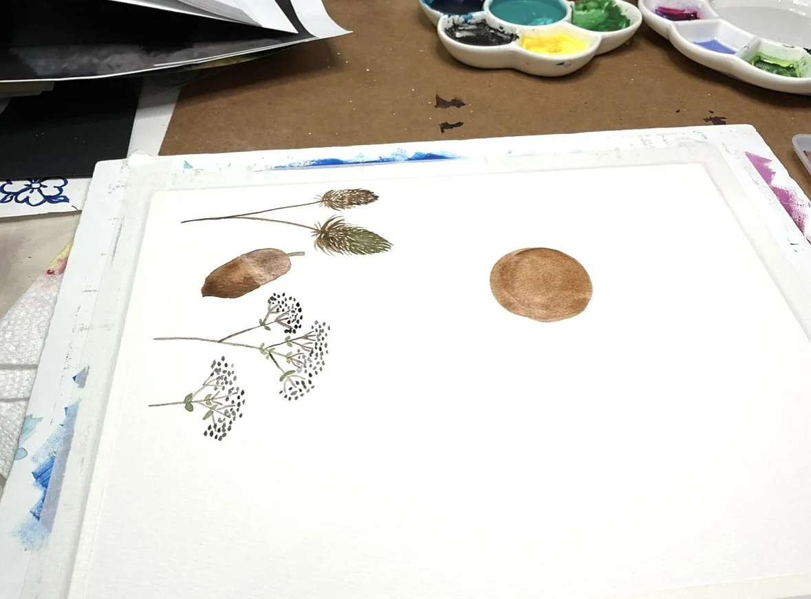
My medium of choice for this piece was watercolor, allowing me to achieve that rich, translucent texture that feels so organic. The first step in any pattern design is getting the colors right. I spent time mixing and swatching until I had the perfect shades—from the deep, moody plums of the coleus leaves to the sun-kissed golds of the sunflowers. This critical step ensures the final digital prints retain the vibrancy and depth of the original artwork.
Next, I meticulously painted each floral element individually. This is a common practice in surface design because it gives me complete control over the final arrangement. With each motif separated, the opportunities for different pattern layouts are truly endless.
The Art of Arrangement
Once the paint was dry, I scanned the images into my computer. This is where the magic of digital design begins! Using Photoshop, I was able to play with the scale, color, and density to devise a variety of looks.
Here are three different pattern variations I created based on the flowers I painted that evening:
Dense All-Over Repeat: (Far left top image) This variation features a tight, repeating geometric arrangement of the sunflowers and plum-colored coleus. It's the perfect choice for a bold statement wallpaper or a lively kitchen curtain that brings high energy to a space.
Wreath Medallion Repeat: (Top right image) By arranging the flowers in a circular formation, this design creates a beautiful, balanced medallion effect. This sophisticated layout is ideal for accent pieces like throw pillows, tapestries, or as a central detail on bedding.
Spacious Diamond Layout: (Bottom left image) This pattern uses the motifs to create a more open, airy diamond repeat. The negative space allows the deep navy background to shine, lending a classic, tailored feel that would look stunning on a traditional accent wall or a high-end duvet cover.
Be on the lookout for these, or other patterns using these same beautiful motifs, coming soon to my store on products like bedding and wallpaper!
Bringing the Botanical Beauty Home: Color and Texture from a Day Trip
I'm in the process of building new design collections for my portfolio. To get started on the planning, I decided I needed some fresh inspiration, so a few weeks ago I played tourist in my own city and took a trip to the local Botanical Gardens. What an adventure! The gardens are absolutely breathtaking in the early fall.
I'm in the process of building new design collections for my portfolio. To get started on the planning, I decided I needed some fresh inspiration, so a few weeks ago I played tourist in my own city and took a trip to the local Botanical Gardens. What an adventure! The gardens are absolutely breathtaking in the early fall.
I arrived just as they opened on a quiet Friday morning to avoid the crowds. The sun was bright and the air, still a bit warm, carried the crisp scent of late September.
The Unexpected Palette of Shade
The initial stretch of the trail was a welcome relief, covered completely in shade. It was here that I discovered an unexpected bounty of color. I had no idea there were so many vibrant, shade-loving plants!
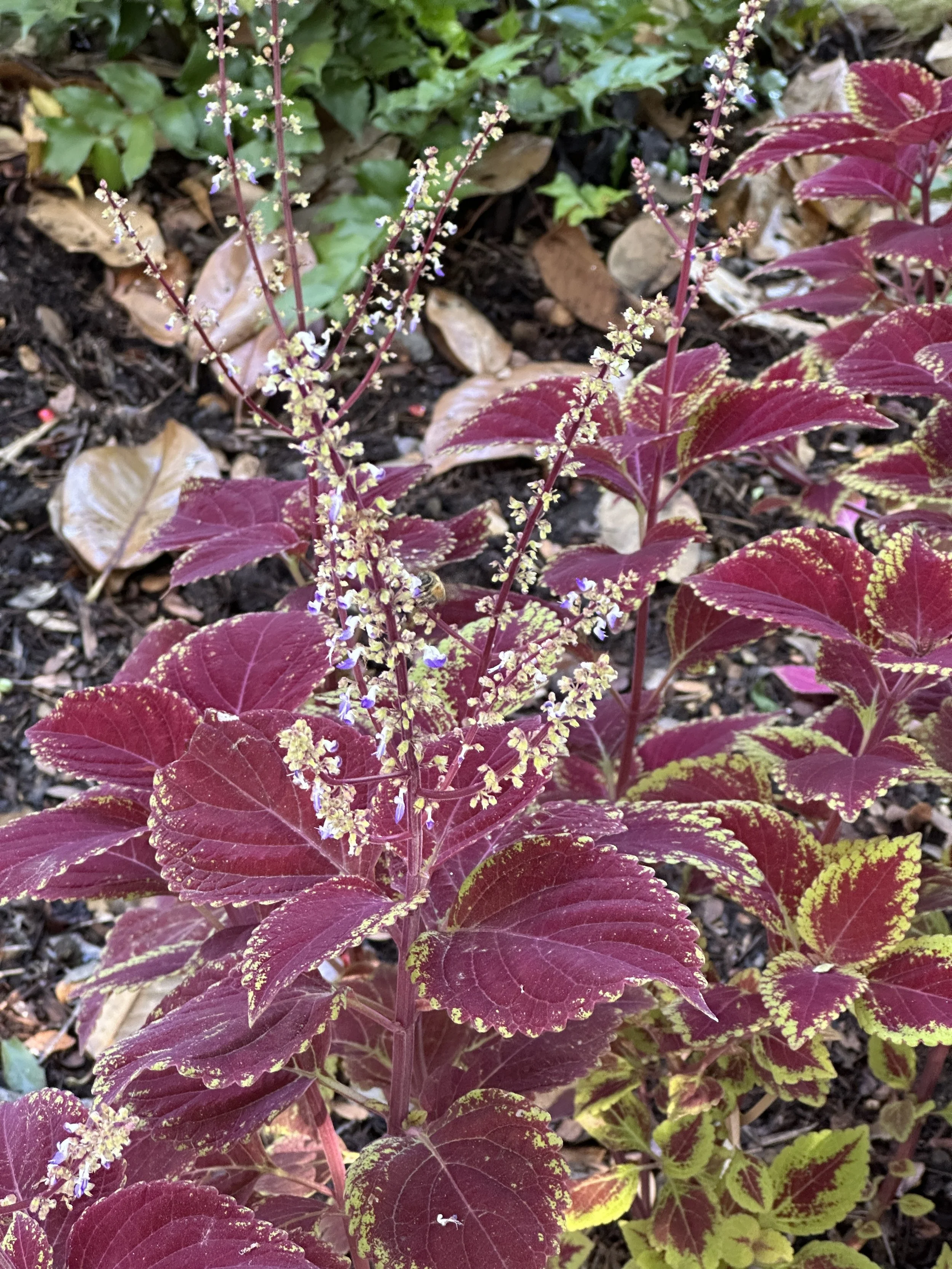
Several garden beds were overflowing with variations of the beautiful Coleus plant. Their leaves showcased rich, velvety burgundy fading into a bright, acidic lime green at the edges—a stunning color clash that somehow feels perfectly grounded and balanced.
This specific contrast between the deep and vivid color is exactly the kind of inspiration I’m excited to translate into home decor. I immediately pictured these designs becoming a luxurious bedspread, bold wallpaper, or a trailing curtain pattern.
A Symphony of Shape and Texture
As the path opened up, the air became thick with the buzz of pollinators in the butterfly garden. Everywhere I looked, I found incredible texture, shape, and vibrant color that begged to be immortalized on canvas or fabric.
One plant, the Red Roselle, with its glossy, deep crimson pods, instantly reminded me of a classic, trailing wallpaper motif—organic yet tailored.
Further along, the delicate, wispy white threads of the Cat’s Whiskers (pictured on the left, below) contrasted beautifully with the tight, jewel-toned globes of the Globe Amaranth (pictured right, below). Imagine a playful serpentine pattern mixing these two textures for a lively powder room wallpaper.
The Grand Finale: Finding Serenity
The most surprising discovery of all had to be the stunning waterfall tucked away right in the middle of the city. Seeing the rushing, silvery white water cascade over the mossy, dark rocks was absolutely breathtaking. It provided a moment of calm and serenity, a quiet anchor to all the vibrant life I’d just experienced. This contrast between the bold energy of the flowers and the quiet power of the water is the core feeling I want to capture in my newest art.
What Will You Bring Home?
The best part of a day like this isn't just the memory—it's the fuel for creating a truly curated home. I've left the gardens with 250 pictures and an entirely new vision for color palettes and artistic textures that I know will resonate with your desire for timeless, inspired decor.
Keep reading this blog! In the next article, I'm peeling back the curtain to show you the botanical pattern directly inspired by this trip and how I'm developing it for print.
My 100-Day Project 2025
I DID IT! I completed the 100-Day Project this year!
I DID IT! I completed the 100-Day Project this year! In case you’re not aware, the 100-Day Project is a free global art project that thousands of people from all over the world participate in. It’s officially held in the spring, but many people do it at different times of the year.
My schedule didn’t allow for me to participate in the spring, so I decided to do mine over the course of the summer. I started the first of June and painted a small picture every day of a subject I’d never painted before. The goal was to learn to paint 100 new things by the end of the summer. For accountability, I also decided to post my paintings on social media every day. Not just the end result, but the actual act of painting. It wasn't the hardest thing I’ve ever done, but it ranks up there as pretty challenging.
I planned the subjects for the first 30 days a week before the challenge started, then planned the remaining 70 days a week at a time. I did face a couple of obstacles, the biggest of which was time. My need to make sure I could paint the subject well, while filming and posting on social media, meant I needed to practice creating the painting at least once before filming it. During this process, I learned that creating content for social media is a very different skill. It was all new to me. I had to learn how to create and edit the video, add music, and figure out the formula that “the Algorithm” would grab hold of and distribute. I’m still not an expert, but I’ve learned a lot. My last few videos are certainly better than the first few.
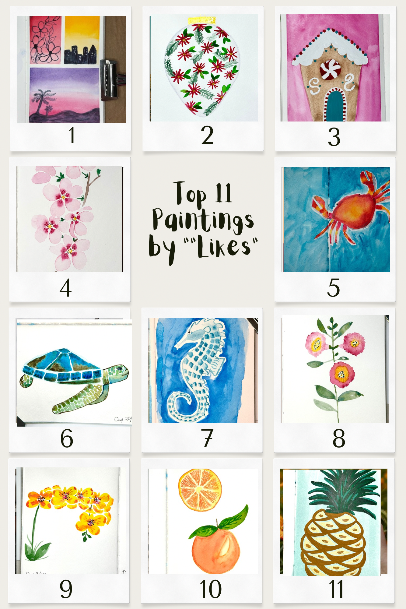
Here is a photo collage of my Top 11 Paintings from the project, ranked by total Facebook and Instagram likes.
Here is a collage of My Favorites from the challenge:
After a bit of contemplation, I've identified a few takeaways from the whole process:
I really like gouache and should use it more often. In case you’re not familiar with it, gouache is much like watercolor in that it can be reactivated with water after it dries. However, while watercolor is mainly transparent, gouache is very opaque. It’s smooth and creamy, like peanut butter. You can use it on top of watercolor without lifting the paint underneath and you can use it all by itself. It's pretty dreamy stuff.
Fruit is very easy and quick to paint.
Animals are harder to paint, but more fun and satisfying.
Landscapes have never been my forte and still aren’t, so I’m determined to master them.
I love painting patterns. "The Algorithm" doesn't like them as much as me, so I didn't paint very many in this project.
I can’t paint with any one medium for too long before I get bored. I have to switch it up. In this challenge I used watercolor, gouache, acrylic paint. I also used India Ink brush pens, Posca markers, and and a few other types of media to create the paintings. And I created one double-spread page painting in collage. This is the flowers in the blue vase right above the Christmas Gnome. The collage turned out to be my absolute favorite of all.
Was it worth it? Yes. Will I do it again? Likely. Did I have fun? Absolutely!
